• In Europe the popular narrative of people in the countryside being left behind, while urban elites benefit from globalization and technological change, is used to explain everything from the Brexit vote to France’s Yellow Vest movement. However, we find that Europe’s rural areas aren’t really losing the economic development race: over the last two decades, they grew faster than urban ones by a whopping 14.6pp. The poorest areas across 24 European countries have moved closer to the average in terms of GDP per capita and the number of areas in the middle of the income distribution has also increased.
  • But does convergence lead to more equality, i.e. are poor areas growing fast enough to close the absolute gap with richer ones? Here the picture is mixed: At first glance, disparities are rising due to the outstanding performance of a handful of “super-champion” areas in Europe, namely urban ones. But GINI coefficients and income concentration measures do paint a more nuanced picture, indicating improvements for the poorest regions over time. The GINI-coefficient for all European areas dropped from 0.26 in 2000 to 0.25 in 2018, meaning that there is (slightly) less inequality between the areas.
  • However, urban areas are the driving forces behind national convergence in Europe. We find that countries with lower initial GDP per capita levels – mainly Eastern and central European ones – show significantly higher growth rates, allowing them to improve their relative position, measured as GDP per capita as a percentage of the EU average. All in all, new EU members (Romania, Estonia) experience real income convergence, while old members (Greece, Italy) are mostly losing ground. However, the cost of catching up for Central and Eastern European countries is increasing divergence between urban areas and others. 

Urban-rural convergence: Poor, rural areas are catching up

The popular narrative goes that Europe is facing an ever-widening urban-rural divide: People in the countryside are being left behind while urban elites reap all the benefits of globalization and technological change. But does this narrative hold against close scrutiny? A lot of work has been done on assessing general diverging/converging economic and societal trends in the European Union (e.g. recent publications by Alcidi (2019); Butkus et al (2018)). But the analyses mainly concentrate on comparisons of developments between old and new member states, or on the divide between Central, Eastern and Southern European countries. Instead, our research focuses on a rigorous urban-rural typology to approach the following questions: Do we observe areas in the EU converging towards their average over time? And are rural areas really losing the race for economic development?

Research by Barro & Sala-i-Martin (1992) was the first to popularize the concept of “beta convergence”, which represents a negative partial correlation between the initial GDP level and the growth in income over time. This is equivalent to saying that poorer countries grow faster than rich ones and thus catch up over time in economic terms. Digging a little deeper, we look at the catch up process across 24 countries in Europe separately by urban, intermediate and rural area averages. All in all, our data set consists of 1,078 areas for which GDP per capita in PPS (Purchasing Power Standard) is available for the years 2000 to 2018.

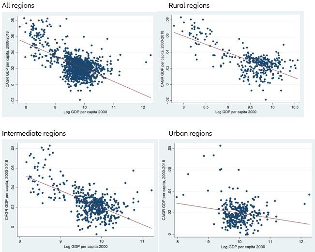
Figure 1 contrasts the initial level of GDP in 2000 with the Compound Annual Growth Rate (CAGR).

We find a significant downward sloping regression line, which confirms that over the last 20 years rural-urban convergence has taken place. There is, however, a significant difference between the types of areas. While the regression line for rural and intermediate areas is a prefect downward sloping line, the regression line for urban areas exhibits a significantly smaller slope. This is further supported by the smaller R2 of the regression: While for rural areas roughly 48% of the variation in annual growth rates can be explained by initial GDP levels, the corresponding figure is only 4% for urban areas.

Figure 1: Beta convergence between regions (CAGR)
Sources: Eurostat, Allianz Research

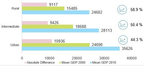
The fact that poorer areas grew faster than richer ones is a strong indication that rural areas are catching up as they are on average much poorer than urban ones: In 2018, GDP per capita was on average 24,602 PPS in rural areas but reached 35,626 PPS in urban areas. And indeed, rural areas have grown by 58.9% on average since 2000 while urban ones advanced by “only” 44.3%. Nonetheless, the absolute increase was still larger in urban areas than in rural ones, though the difference is not particular large (see figure 2).

Other numbers, too, support the finding that rural and poor areas have improved over the last two decades, at least in economic terms. In 2000, the five poorest areas – mainly rural areas in Romania –  only had 12.3% to 15.4% of the average GDP per capita in the EU – these numbers went up to a range of 18.3% to 25.4% by 2018.

At the other end of the spectrum, however, we see the opposite trend. The five richest areas – first and foremost the City of London and Westminster, but also cities like Wolfsburg and Ingolstadt – moved farther away from the average: Their GDP per capita levels increased from 375-1,099 % (2000) to 415-1,406% (2018) of the EU average. But the number of areas that dramatically outperform the EU average (GDP per capita levels of 150% or more compared to the average) has nonetheless fallen from 101 to 94. Another indicator that speaks for regional convergence is that the number of areas that are located in the 80-120% interval increased from 462 to 502. So it appears that only a handful of “super-champion” areas show outstanding economic performance, though overall rural and urban areas seem to converge.

Figure 2: Relative and absolute development of GDP p.c. from 2000 to 2018, in PPS
Sources: Eurostat, Allianz Research

Rural-urban disparities – a mixed picture

Has rural-urban convergence in Europe reduced inequality i.e. income disparities between areas? The comparison of average developments of rural and urban areas has already led to the conclusion that higher growth rates (or beta convergence) can go hand in hand with rising (absolute) disparities. In the literature, this concept of a simple reduction of disparities is often referred to as “sigma convergence”, expressed with the “Coefficient of Variation” (CV) i.e. a normalized measure of dispersion of a probability distribution. A higher ratio of the standard deviation to the mean represents a more unbalanced distribution, while a decreasing coefficient of variation is a sign of more equal distribution.

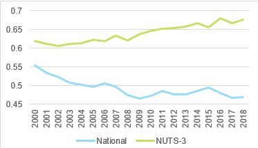
Figure 3 displays the CVs for rural and urban areas, as well as at the overall national level in Europe. The decreasing CV at the national level (from 0.55 in 2000 to 0.47 in 2018) confirms our findings that convergence is at work between countries in Europe. The picture changes when we look at the computed values of the CV for NUTS-3 areas. Since 2000 we observe a more or less steady increase, with the coefficient reaching a value of 0.68 in 2018 compared to the initial value of 0.62. Therefore, rural-urban disparities seem to be on the increase, in line with bigger absolute differences between rural and urban areas. The CV, however, is pretty sensitive to changes in the upper end of the distribution; it might be distorted by the outstanding performance of just a few “super-champion” areas.

Figure 3: Coefficient of Variation, rural-urban (NUT-3) and national (EU members) levels
Sources: Eurostat, Allianz Research

A broader and less distorted measure of inequality is the concept of the GINI coefficient. It varies between 0 (perfect equality) and 1 (perfect inequality), hence a decrease of inequality due to a convergence process should go hand-in-hand with a decline of the GINI coefficient.

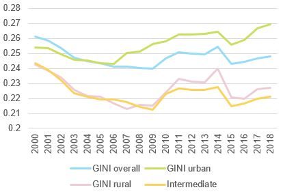
Figure 4 shows the development of the GINI coefficient for Europe as a whole, as well as the GINIs for all three types of rural-urban classifications. For the overall GINI coefficient, a downward trend is detectable: It decreased from – an already low – 0.261 (2000) to 0.247 (2018). But it was not a continuous development. The financial crisis marks a break, since then the overall GINI has slightly increased (although it dropped significantly in 2015).

Figure 4: Development of GINI
Sources: Eurostat, Allianz Research

A similar development is also visible for the three other GINI coefficients: The financial crisis was a turning point for the downward trend. But there is a remarkable difference between the GINIs for rural and intermediate areas on the one side and for urban areas on the other side. While the coefficients for rural and intermediate areas in 2018 are still well below the initial levels in 2000 – signaling less inequality – this is not true for urban area. They experience a nearly steady increase of their GINI coefficient (+1.5 pp since 2006). This means that inequality between cities is on the rise. Some “super champion” regions are drifting apart, leading also to growing regional disparities on the whole, as measured by the CV.

Another more granular measure than the CV for (in)equality is the income concentration per population resp. regional deciles. In this context we look at total values of GDP, rather than per capita levels; e.g. the question is: What is the share in total income of the richest 10% of the regions? And how has it evolved over the years?

For each year, the regions are ranked according to their GDP per capita levels and divided into deciles. Since in total we have 1,078 regions, each decile consists of roughly 108 regions. That means, however, that the selection of regions that fall in one specific decile is dynamic, meaning that for each year the compositions within the deciles can change. This causes a problem: It could lead to a change of population that this decile accounts for; for example, when highly populous urban region are moved into a different cluster.

To solve this issue, we introduced our own statistical figure: We divide the percentage that a decile accounts for in terms of absolute GDP by the percentage that the decile accounts for in terms of population. We call this measure “income concentration”. Figure 5 displays the income concentration measures for three regional deciles: the richest 10%, the median decile and the poorest 10%.

Figure 5: Income concentration for different population deciles
Sources: Eurostat, Allianz Research

For two of the cluster income concentration is remarkable stable. The analysis for the 10% richest regions reveals only some movements in our concentration figure. Initially, the regions in the decile account for 24.5 % of the total GDP across all countries. This number decreases to 23.9% in 2018. The ratio of population shows a similar development, with a decrease from 12.5% to 12.2% of total population. Thus, our concentration figure states that in 2000 the 10% richest regions account for nearly double the share of GDP compared to the share of population. This figure shows almost no fluctuation over the years and has exactly the same value (1.96) in 2018 as in in the year 2000.

For the median percentile, we see a very similar picture, with income concentration more or less stable at around 0.9. During the timespan, the median regions account for a minimum value of 6.2% to a maximum value of 7.7% of the absolute GDP, while accounting for 7.1 to 8.6 % of the absolute population. The fact that the concentration indicator is close to one shows that income in the median regions is close to the average income, an indication for a rather equal income distribution among the regions.

Only for the poorest 10% of the regions, income concentration changes significantly – and for the better: The concentration indicator rises steadily from a value of 0.25 in 2000 to 0.41 in 2018. (Though this still means that the poorest 10% of regions account for less than half the share of GDP than of the population.) The analysis of the GDP and population ratio allows us to make an interesting deduction for the reasons of this change. Over the last two decades, the GDP ratio only increased by 0.3 percentage points. However, the population ratio declined by 3.5 percentage points: More or less the same GDP is produced by less people i.e. GDP per capita is continuously rising. The obvious explanation for this trend: Internal migration which drives people from regions at the bottom of the income distribution – which are predominantly rural ones – to regions in higher income deciles. But this “rural exodus” does not lead to a hemorrhaging of jobs and opportunities – as shown by the slightly increasing GDP share. Thus, rural exodus serves as a balancing mechanism, smoothing the income distribution between regions, at least at the bottom.

National convergence is also occurring – but at a price

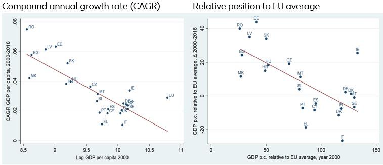
A clear convergence trend can also be detected at a national level in Europe – see Figure 6 (left panel). Countries with initially lower GDP per capita levels – mainly Eastern and central European countries – show significantly higher annual growth rates.

This catch-up enabled all new member countries – except for Cyprus – to improve their relative position, measured as GDP per capita as a percentage of the EU average (see figure 6, right panel). On the other hand, most of the old members’ relative positions deteriorated, with Greece and Italy dropping by 20pp or more over the last 20 years; the latter finds itself now below the EU average in terms of GDP per capita. Only Germany and Denmark – by a very thin margin – and Ireland – by a whopping 25pp – managed to improve relatively since the introduction of the euro. In the case of Ireland, however, this improvement owes much to a quirk in national accounts in 2015, which gave an artificial boost to economic growth. All in all, this picture reflects a main finding from the literature: New EU members experience real income convergence, while old members are mostly losing ground.

Figure 6: Beta convergence between countries
Sources: Eurostat, Allianz Research
Digging a little deeper allows us to identify the main drivers for convergence in Eastern and Central Europe. The results demonstrate a clear pattern: On average, there was no rural or intermediate area within these countries that exhibits a 40 percentage (or more) increase in its relative position vis-à-vis the EU average. For the urban areas, on the other hand, six countries are above that level. Romania, with a nearly 80 pp increase, and Slovakia with a more than 100 percentage points represent the high end of the range of relative improvements. Although all area averages in these countries, including the rural ones, improved on average their position, the analysis makes it pretty clear that the economic progress was predominantly due to growth in urban areas. National convergence is driven first and foremost by a “champion area” (which is often the capital city) that outperforms other regions. The performance of this champion area drives the national average, while other areas in the country are unable to keep up the pace. In other words: The price for Central and Eastern European countries catching up is increasing divergence between urban areas and others.
Head of Insurance, Wealth and Trend Research
arne.holzhausen@allianz.com
Economic Research Assistant