Color mood boards
Colors
The distinctive shades we use to bring our media to life
We use colors inspired by the places our customers live.
We developed our new color palette to be vibrant and inspired by the places our customers live. We use colors in a purposeful way to reflect the essence of our brand. Our versatile palette is designed to work across digital and print communication.
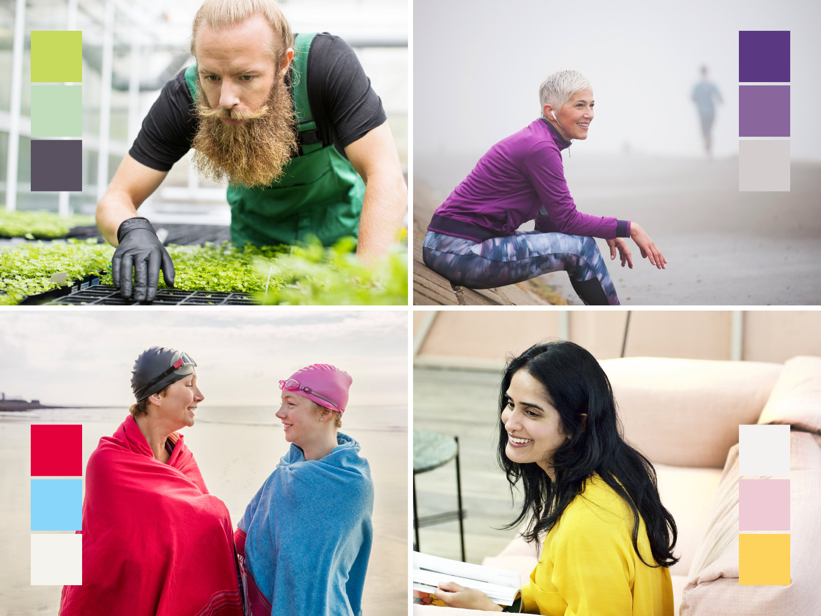
Our colors in use – take a look
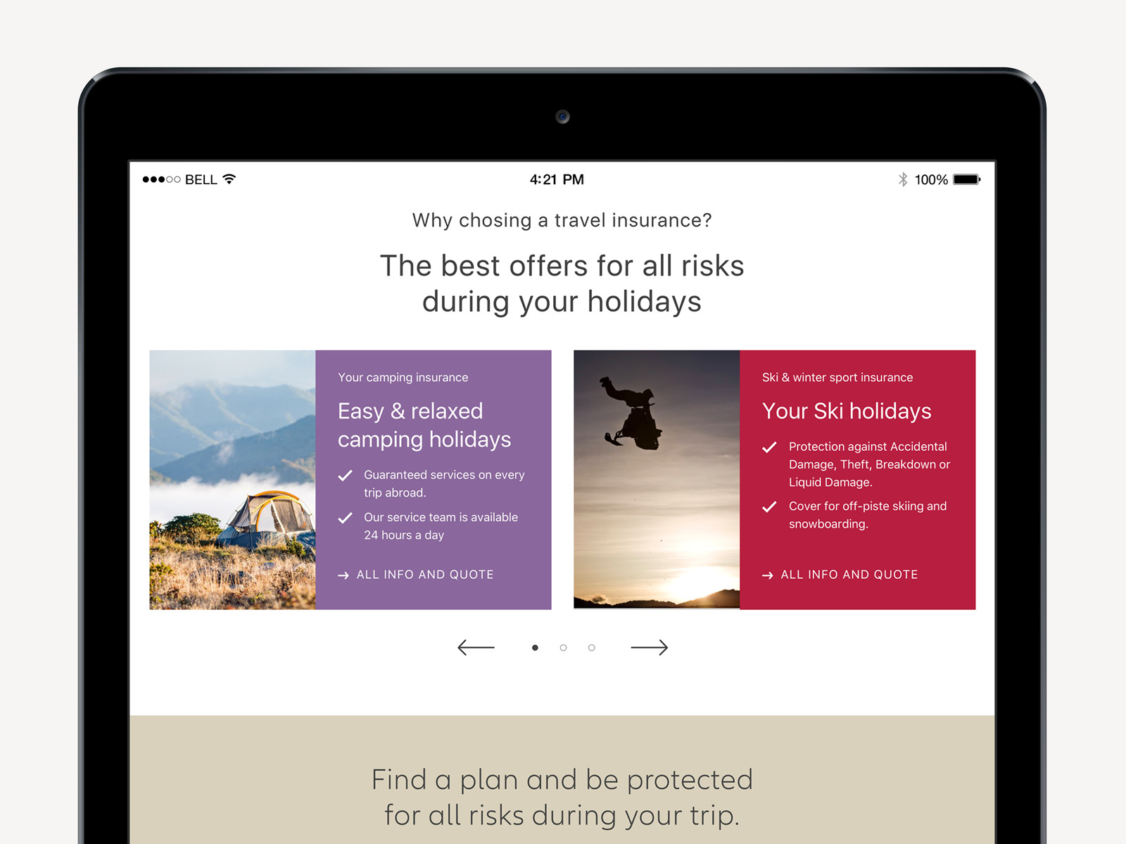
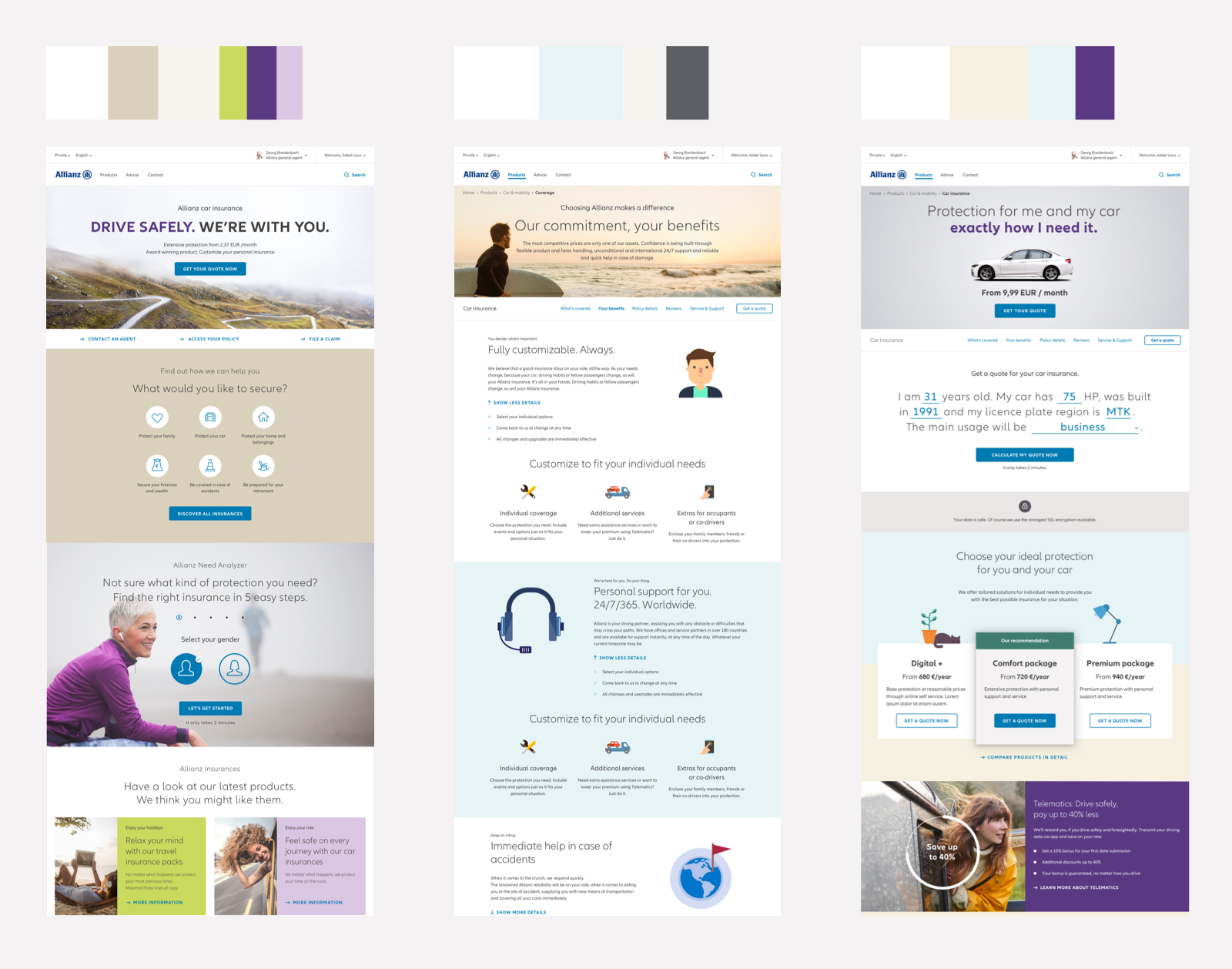
Website

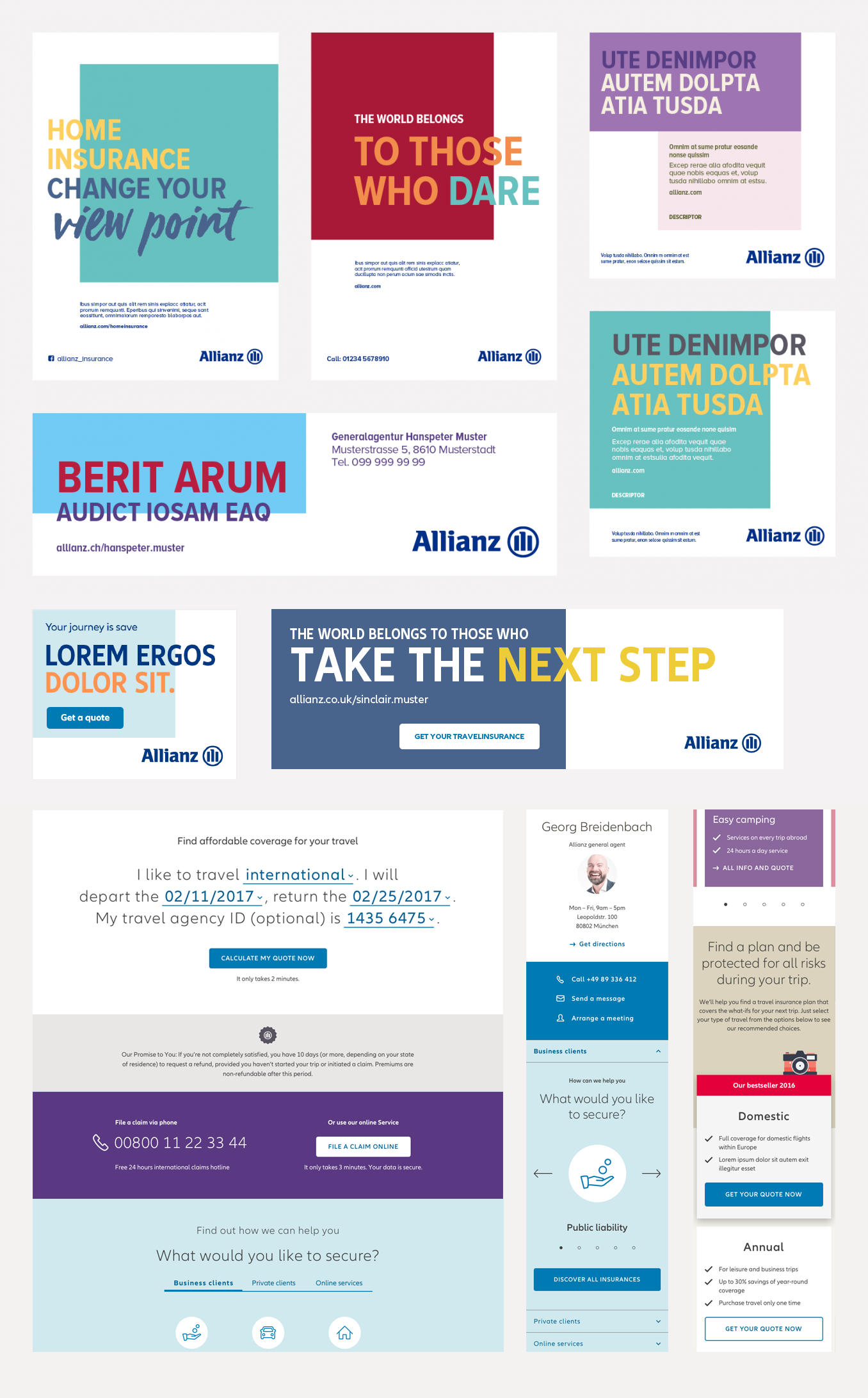
Social media
How we use colors in digital and print media
-
Colors and imagery
-
Colors without imagery
Create a harmony of colors
Choosing the right colors to use with our imagery is key to creating layouts that feel balanced. Tones in photography should inform the colors we select to create a visual harmony across all layout elements.
In digital media, use different categories of the secondary palette to guide the user's attention and keep an overall color balance. In general, choose colors from the soft/calm palette for backgrounds, and colors from the vibrant or rich/luxurious palette to highlight key headlines or important page sections.
In digital media, use different categories of the secondary palette to guide the user's attention and keep an overall color balance. In general, choose colors from the soft/calm palette for backgrounds, and colors from the vibrant or rich/luxurious palette to highlight key headlines or important page sections.
Color combination
Colour should be used confidently, with or without photography, across all Allianz media applications. When photography is not used, colours are applied to all layout elements, such as boxes (see Layout section for information) and typography.
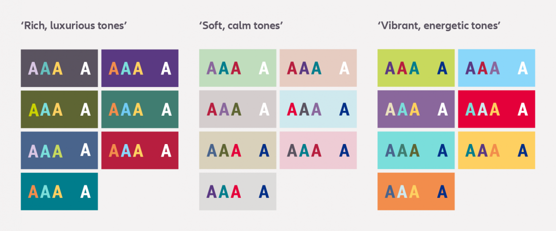
You can create various colour combinations using the Allianz secondary colour palette. To help you choose, the following image shows recommended sets of colour combinations to use for text on colour backgrounds. Each set provides well-balanced colour contrasts for both print and digital. Remember, it’s essential that the colour combinations don't interfere with text legibility.
Our defined color palettes
-
Primary colors
-
Secondary colors: Rich, luxurous
-
Secondary colors: Vibrant, energetic
-
Secondary colors: Soft, calm
-
Greyscale
Action colors, additional colors and direct tones
We use two blue colors to guide the users' attention to interactive elements: Bright Action Color and Dark Action Color:
Bright Action Color (#007AB3) is used for solid buttons, lines of clickable elements, bold action background areas and clickable icons with text labels.
Dark Action Color (#006192) is used for other elements like linked text and clickable elements such as icons that convey vital information not shown with text, for example, the X icon used to close flyouts & modals.
To ensure fully accessible design, sufficient color-contrast ratio is needed when placing text elements on colored backgrounds. Depending on the brightness or darkness of the background color, either gray (#414141) or white (#FFFFFF) needs to be used as foreground (text) color.
Exception: Direct buttons (Green #3DA556 or Orange #F86200 backgrounds with white text) are an official exception due to branding reasons.

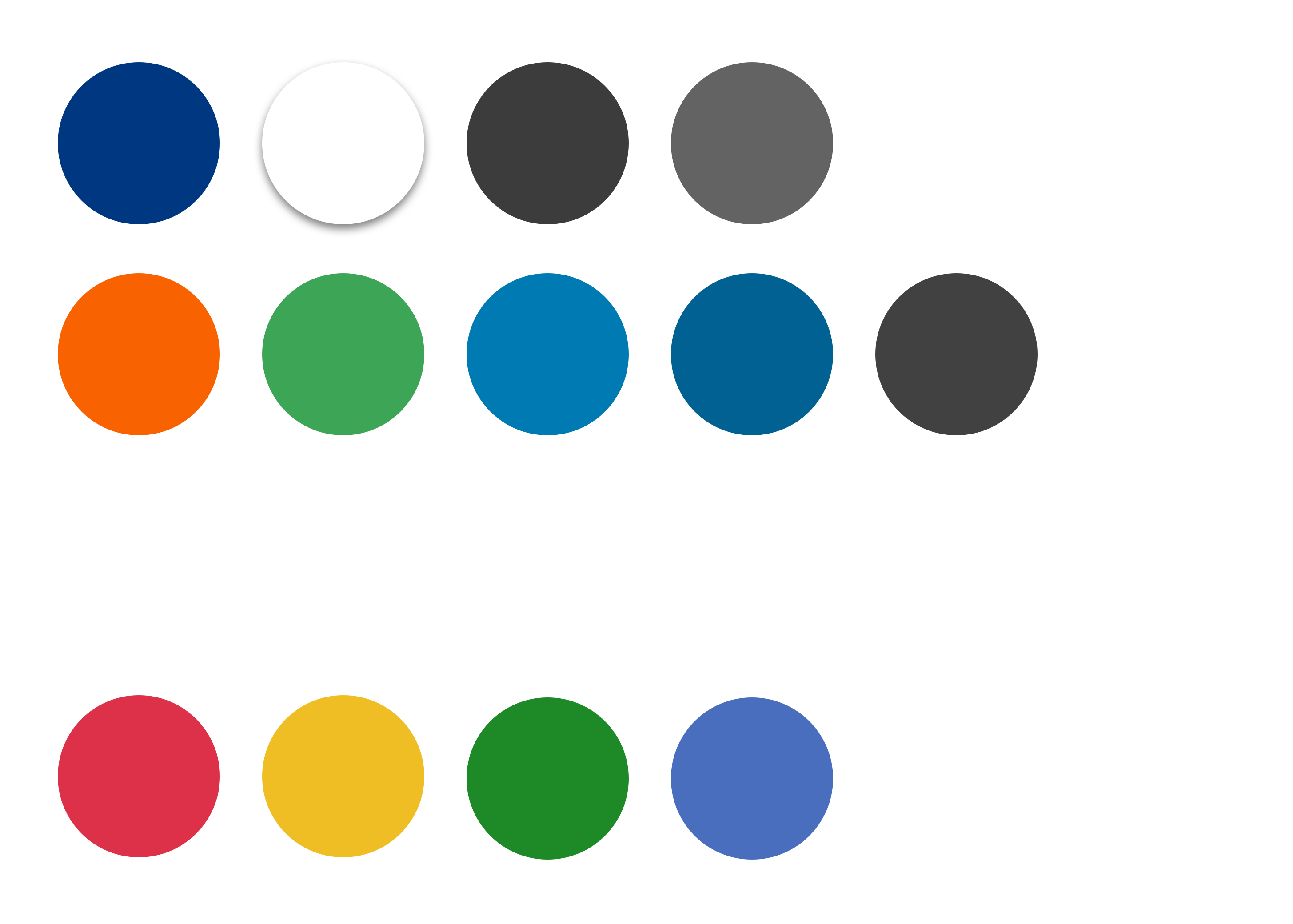
Allianz Blue
HEX #003781
RGB 0, 55, 129
RAL 5002
PMS 287C
CMYK-C 100,75,2,18
CMYK-U 100,65,0,15

White
HEX #FFFFFF
RGB 255, 255, 255
RAL
PMS
CMYK-C 0,0,0,0
CMYK-U 0,0,0,0

Direct Orange
Digital Use
HEX #F86200
RGB 248, 98, 0

Direct Green
Digital Use
HEX #3DA556
RGB 61, 165, 86

Bright Action
Digital Use
HEX #007AB3
RGB 0, 122, 179

Dark Action
Digital Use
HEX #006192
RGB 0, 97, 146

Text Colour (Grey 500)
Digital Use
HEX #414141
HEX #414141
RGB 65, 65, 65

Error
Digital Use
HEX #DC3149
HEX #DC3149
RGB 220, 49, 73

Warning
Digital Use
HEX #EFBE25
RGB 239, 190, 37

Success
Digital Use
HEX #1E8927
HEX #1E8927
RGB 30, 137, 37

General info
Digital Use
HEX #496EBD
RGB 73, 110, 189

Rich, luxurious tones
Color selections should be complimentary yet still have an element of contrast. Therefor modules with darker tones from the secondary color palette are used rarely: 1 to max. 2 elements per page type should be used.
Rich, luxurious tones create as background colors a harmonious contrast e.g. within 50/50 teaser, teaser within a carousel, small service modules or as promotional element.
Each rich, luxuriour tone has one tint to allow for greater flexibility.

Rich Petrol Light
HEX #B1DADD
RGB 177, 218, 221
CMYK 47, 15, 17, 3
RAL 210 80 20
PMS 630 C

Rich Petrol
HEX #007D8C
RGB 0, 125, 140
CMYK 95, 30, 35, 5
RAL 210 40 38
PMS 633

Rich Red Light
HEX #F1C8D0
RGB 241, 200, 208
CMYK 15, 50, 35, 0
RAL 010 80 15
PMS 699 C

Rich Red
HEX #B71E3F
RGB 183, 30, 63
CMYK 30, 100, 70, 0
RAL 020 30 48
PMS 201

Rich Blue Light
HEX #CAD4DE
RGB 202, 212, 222
CMYK 60, 45, 22, 0
RAL 270 70 15
PMS 651 C

Rich Blue
HEX #49648C
RGB 73, 100, 140
CMYK 80, 60, 30, 0
RAL 260 40 20
PMS 653

Rich Green Light
HEX #C3D8D4
RGB 195, 216, 212
CMYK 35, 9, 25, 2
RAL 190 80 10
PMS 5513 C

Rich Green
HEX #407D71
RGB 64, 125, 113
CMYK 70, 18, 50, 4
RAL 180 50 30
PMS 7473

Rich Olive Light
HEX #D4D5C8
RGB 212, 213, 200
CMYK 49, 35, 68, 20
RAL 120 80 10
PMS 5665 C

Rich Olive
HEX #5B5D30
RGB 91, 93, 48
CMYK 65, 46, 90, 26
RAL 100 30 20
PMS 7763

Rich Purple Light
HEX #DAD0E1
RGB 218, 208, 228
CMYK 59, 62, 8, 4
RAL 290 80 15
PMS

Rich Purple
HEX #5A3982
RGB 90, 57, 130
CMYK 78, 83, 10, 5
RAL 310 30 35
PMS 7679

Rich Grey Light
HEX #CAD4DE
RGB 202, 212, 222
CMYK 60, 45, 22, 0
RAL 270 70 15
PMS 651 C

Rich Grey
HEX #49648C
RGB 73, 100, 140
CMYK 80, 60, 30, 0
RAL 260 40 20
PMS 653

Vibrant, energetic tones
Vibrant tones are use to set accents, to emphasize words.
Accent colors can be used for illustrations, single freestanding elements (e.g. star rating), infographics, promotional callout elements and coloured text on the stage.
Tip: Use light tones from the vibrant tone palette more for teasers. Be careful with the usage as a full background colour.
Each vibrant, energetic tone has one tint to allow for greater flexibility.

Vibrant Orange Light
HEX #F7CAAB
RGB 247, 202, 171
CMYK 0, 27, 37, 0
RAL 050 80 30
PMS 1555 C

Vibrant Orange
HEX #FF934F
RGB 255, 147, 79
CMYK 0, 54, 73, 0
RAL 050 60 60
PMS 7577 C

Vibrant Yellow Light
HEX #FFE8B0
RGB 255, 232, 176
CMYK 0, 10, 35, 0
RAL 085 90 30
PMS 7401 C

Vibrant Yellow
HEX #FDD25C
RGB 253, 210, 92
CMYK 0, 20, 70, 0
RAL 080 80 50
PMS 7403 C

Vibrant Turquoise Light
HEX #C3E8E7
RGB 195, 232, 231
CMYK 30, 0, 15, 0
RAL 200 80 20
PMS 629 C

Vibrant Turquoise
HEX #7FE4E0
RGB 127, 228, 224
CMYK 60, 0, 30, 0
RAL 190 70 35
PMS 325

Vibrant Red Light
HEX #F7C7C3
RGB 247, 199, 195
CMYK 0, 50, 35, 0
RAL 030 80 20
PMS 196 C

Vibrant Red
HEX #E4003A
RGB 228, 0, 58
CMYK 0, 100, 70, 0
RAL 030 40 60
PMS 199

Vibrant Purple Light
HEX #E1CFEB
RGB 225, 207, 235
CMYK 23, 30, 0, 0
RAL 300 80 15
PMS 2635 C

Vibrant Purple
HEX #8A679C
RGB 138, 103, 156
CMYK 45, 60, 0, 0
RAL 310 50 40
PMS 2577

Vibrant Blue Light
HEX #C1EBFB
RGB 193, 235, 251
CMYK 55, 0, 0, 0
RAL 230 70 30
PMS 297

Vibrant Blue
HEX #96DCFA
RGB 150, 220, 250
CMYK 55, 0, 0, 0
RAL 230 70 30
PMS 297

Vibrant Green Light
HEX #E3EBAF
RGB 227, 235, 175
CMYK 17, 0, 45, 0
RAL 110 80 40
PMS 372 C

Vibrant Green
HEX #CCDD61
RGB 204, 221, 97
CMYK 33, 0, 90, 0
RAL 110 70 60
PMS 390

Soft, calm tones
Light colors from the secondary color palette and white are used for most modules to keep an overall friendly and lightweight look.
Gradients within the soft/calm tones palette can be used for several backgrounds close to each other, e.g. teaser backgrounds.
Each soft, calm tone has two tint to allow for greater flexibility.

Soft Mud Lightest
HEX #F5F3ED
RGB 245, 243, 237
CMYK 0, 0, 0, 0
RAL 000 90 00
PMS

Soft Mud Light
HEX #EBE7DB
RGB 235, 231, 219
CMYK 8, 6, 7, 0
RAL 080 80 10
PMS

Soft Mud
HEX #DBD3BD
RGB 219, 211, 189
CMYK 16, 12, 13, 0
RAL 080 70 20
PMS 5315

Soft Rose Lightest
HEX #FBF2F4
RGB 251, 242, 244
CMYK 0, 0, 0, 0
RAL 360 92 05
PMS

Soft Rose Light
HEX #F6E5EA
RGB 246, 229, 234
CMYK 3, 13, 5, 0
RAL
PMS

Soft Rose
HEX #EECCD5
RGB 238, 204, 213
CMYK 6, 26, 9, 0
RAL 080 80 10
PMS

Soft Blue Lightest
HEX #F1F9FA
RGB 241, 249, 250
CMYK 0, 0, 0, 0
RAL 250 92 05
PMS

Soft Blue Light
HEX #E6F4F6
RGB 230, 244, 246
CMYK 10, 0, 4, 0
RAL
PMS

Soft Blue
HEX #CFE9EE
RGB 207, 233, 238
CMYK 20, 0, 8, 0
RAL 240 80 20
PMS 290

Soft Beige Lightest
HEX #FAF7EF
RGB 250, 247, 239
CMYK 0, 0, 0, 0
RAL
PMS

Soft Beige Light
HEX #F5F0EO
RGB 245, 240, 224
CMYK 5, 5, 15, 0
RAL
PMS

Soft Beige
HEX #EBE1BF
RGB 235, 225, 191
CMYK 10, 10, 30, 0
RAL 085 80 20
PMS 7500

Soft Grey Lightest
HEX #F8F4F2
RGB 248, 244, 242
CMYK 0, 0, 0, 0
RAL 000 90 00
PMS

Soft Grey Light
HEX #EFE8E6
RGB 239, 232, 230
CMYK 19, 14, 15, 0
RAL 020 80 05
PMS

Soft Grey
HEX #D4CDCD
RGB 212, 205, 205
CMYK 38, 28, 30, 0
RAL 020 70 05
PMS 2331

Soft Nude Lightest
HEX #F9F2EF
RGB 249, 242, 239
CMYK 0, 0, 0, 0
RAL 050 90 05
PMS

Soft Nude Light
HEX #F3E5DF
RGB 243, 229, 223
CMYK 10, 17, 19, 0
RAL
PMS

Soft Nude
HEX #EACFC0
RGB 234, 207, 192
CMYK 20, 34, 38, 0
RAL 050 80 20
PMS 4735

Soft Green Lightest
HEX #EFF6EE
RGB 239, 246, 238
CMYK 0, 0, 0, 0
RAL 130 92 05
PMS

Soft Green Light
HEX #DFEEDE
RGB 223, 238, 222
CMYK 15, 0, 17, 0
RAL
PMS

Soft Green
HEX #C0DDBD
RGB 192, 221, 189
CMYK 30, 0, 33, 0
RAL 150 80 00
PMS
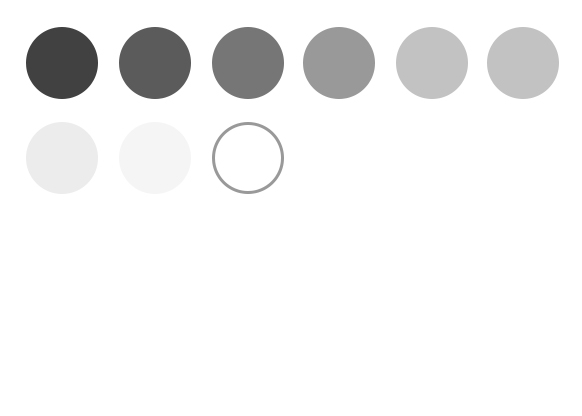
Greyscale & White
The different grey shades are used for most modules to keep an overall look.
Gradients within greyscales palette can be used for several backgrounds close to each other, e.g. teaser backgrounds.

Grey 500
HEX #414141
RGB 65, 65, 65

Grey 450
HEX #5B5B5B
RGB 91, 91, 91

Grey 350
HEX #767676
RGB 118, 118, 118

Grey 300
HEX #999999
RGB 153, 153, 153

Grey 200
HEX #C2C2C2
RGB 194, 194, 194

Grey 100
HEX #D9D9D9
RGB 217, 217, 217

Grey 050
HEX #ECECEC
RGB 236, 236, 236

Grey 025
HEX #F5F5F5
RGB 245, 245, 245

White
HEX #FFFFFF
RGB 255, 255, 255
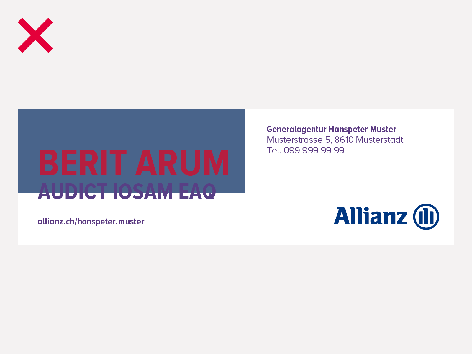
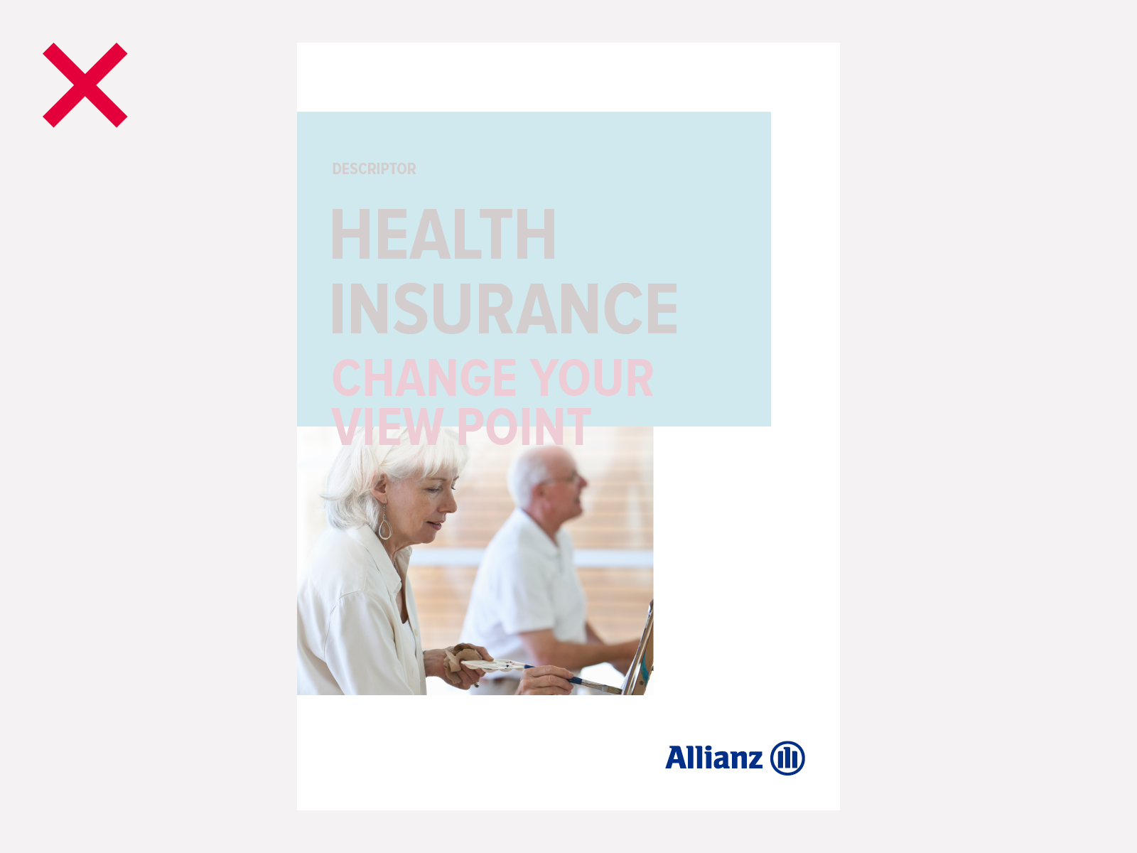
Color Don'ts
Below are examples of what to avoid when using colors.
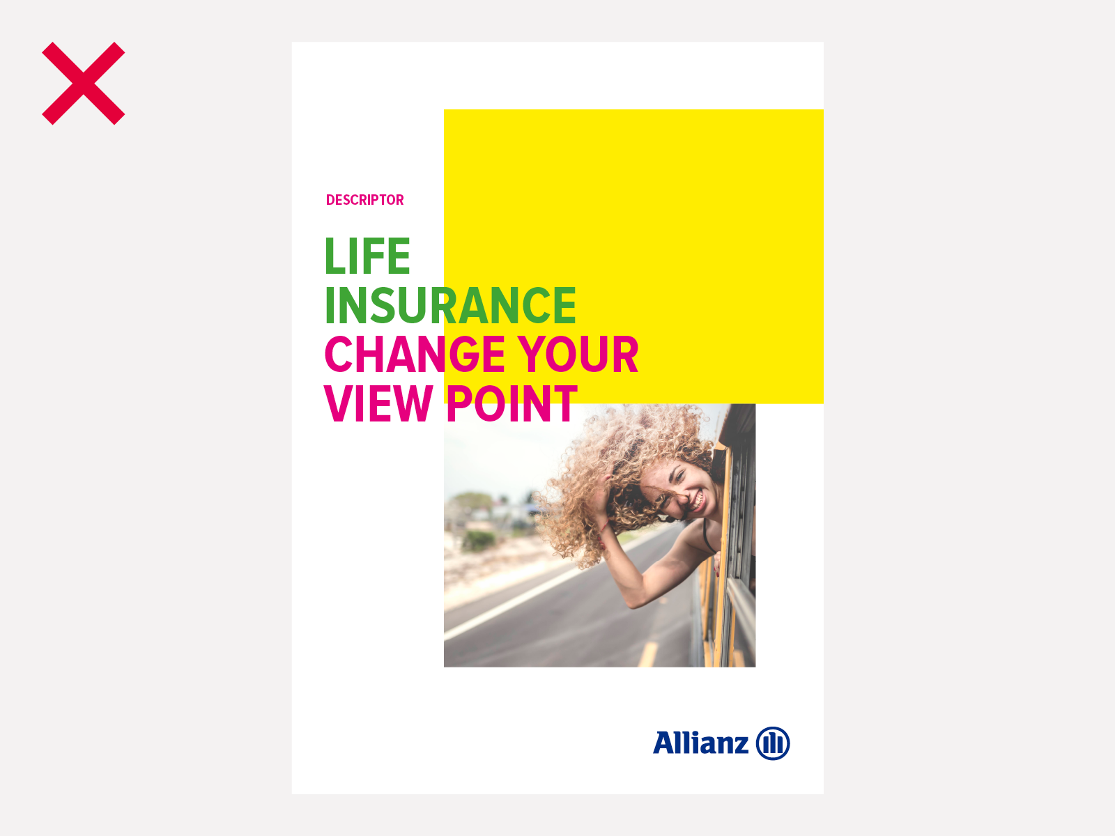
Don't use colors that are not from the Allianz color palette
Don't typeset text with tight/wide leading or tracking
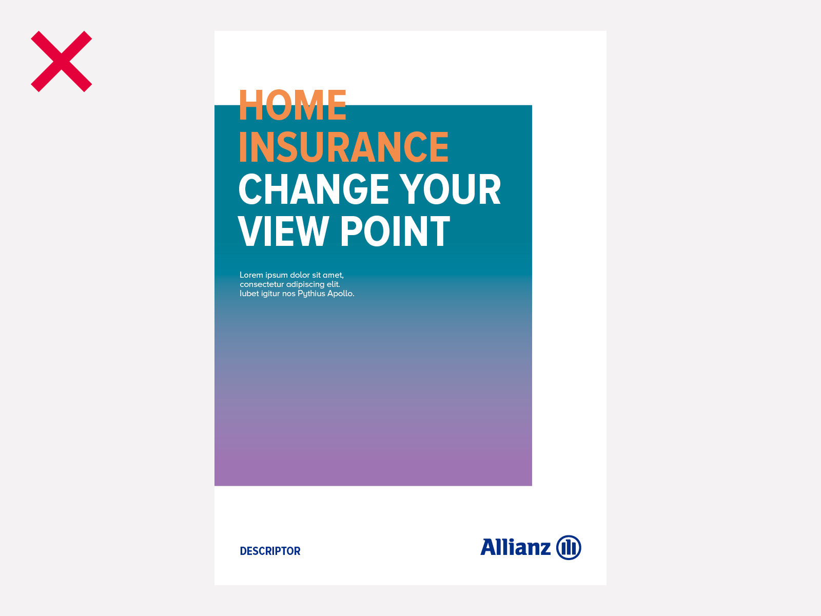
Always use solid color – never gradients
Don't use the extended shades specified for infographics in typography or layout boxes
