We’ve set clear, simple rules to make sure the icons we use in markets around the world are as consistent and compliant as possible.
Iconography
Icons for products and functionality
Our icons are clean and modern, legible on screen and at small scale. They’re primarily for use online, but can also be used in other applications.
Icon basics

Circle
The circle surrounds the inner object and completes the icon.
Inner object
Includes the stylized form of different objects. Choosing the right icon depends on the subject in question.
Colors
Icons in digital applications are 'Action blue' (#007AB3), which is similar to the link and button colors.
Deep dive for creating and using icons
Main principles
Artboard
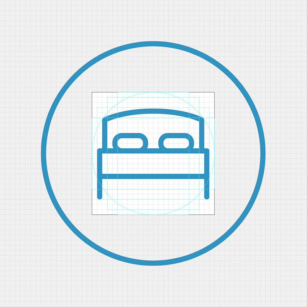
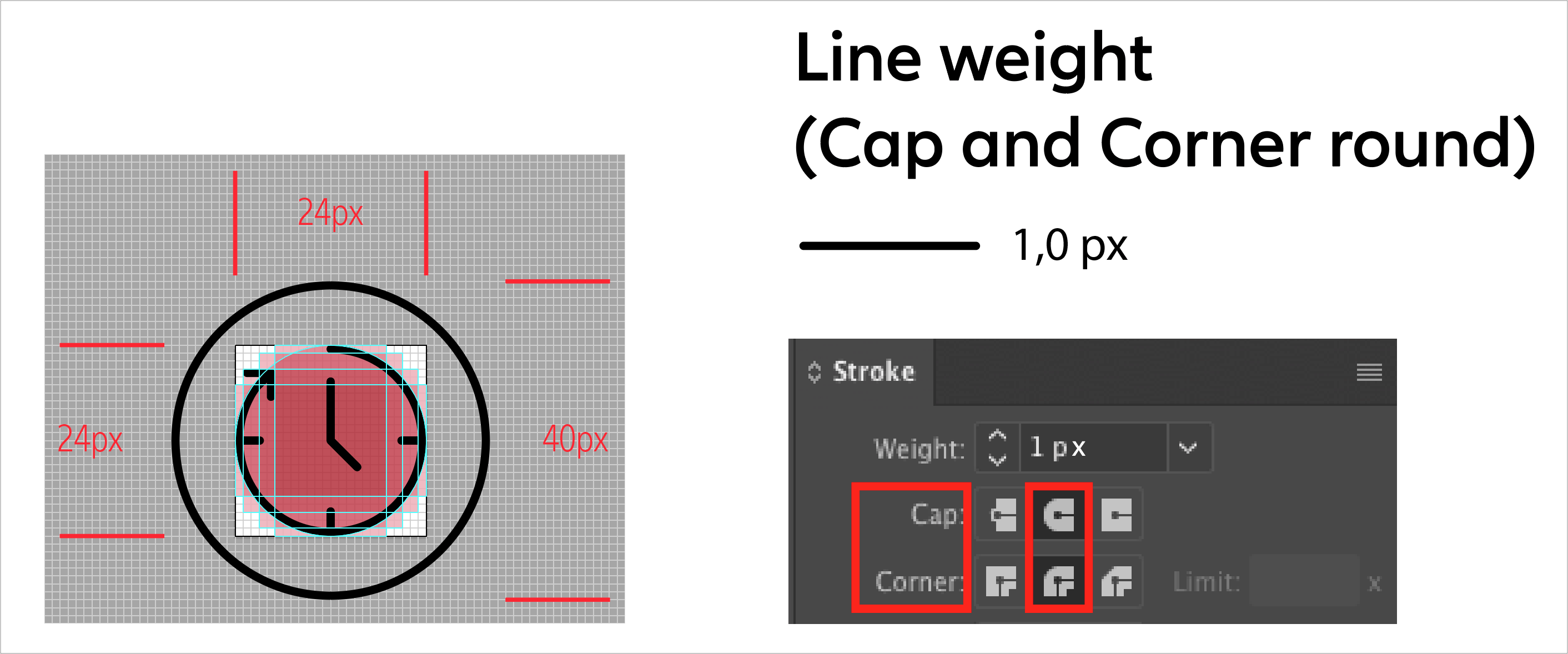
The inner objects of icons are built on a basic grid of 24 x 24 pixels.
Please note: Do not extend past the artboard.
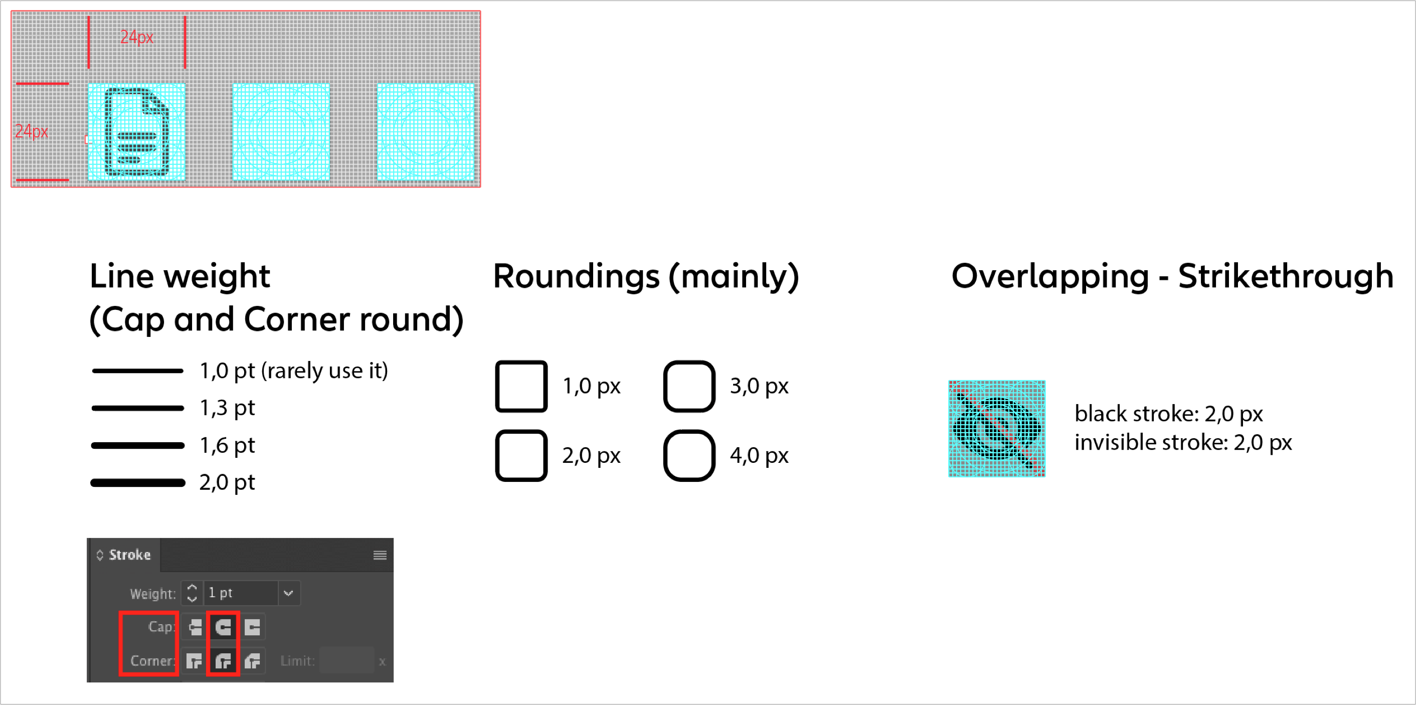
Line weight
The line weight on this base is 1 pixel and must be respected. The lines are pixel-perfect adapted.
Guidelines and tips for creating icons
Please pay attention to the following guides to ensure the harmony between icons:
Icons built within Adobe Illustrator
Icons built within Adobe Illustrator
Grid for functional icons (preview)
Grid for functional icons (preview)
Grid for product icons (preview)
Grid for product icons (preview)
Alignment to the pixel grid
Alignment to the pixel grid
Conclusion & Note: The line width must have evenly a weight of 1 pixel, as well as the distance between lines.
Icons built within the sketch library
Icons built within the sketch library
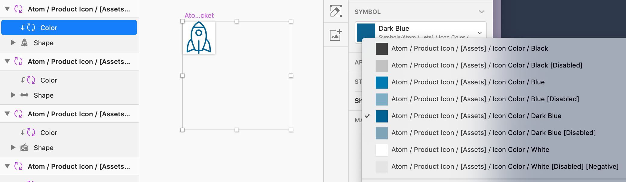
The color layer has been created as a nested symbol in order to override colors and keep control about the allowed colors.
For final artwork: Follow the structure & naming conventions within sketch. Change only necessary layers/names.
For final artwork: Follow the structure & naming conventions within sketch. Change only necessary layers/names.
Example icon: Atom / Product Icon / [Assets] / Icons / Rocket
Note: Once you’re creating an icon, please send the final result as following:
- All icons within an ai-file (includes all icons as outlines, each icons is listed on a 24x24px artboard),
- Each single icon as a) eps-file (icon converted into fills on a 24x24px artboard) and b) svg-file
See export in the following chapters 02. SVG Export Settings and 03. Naming conventions
Download the Icon Grids
Download the Icon Grids
Please go to our Icon Tool to get and edit individual icons
Download the 'Allianz Icons Grid' here:
Download the 'Allianz Icons Grid' here:
Best practices
- Square icons: create an artboard for an individual icon that is 24 x 24 pixels.
- Each artboard and the artwork within it must be aligned to the pixel grid.
- Icons should be at whole pixels. No decimals in x and y coordinates or width and height fields.
- All strokes must be expanded.
- All strokes must be full pixels.
- Combine all possible shapes and paths.
- Ungroup icon layers completely. It should be on the top-most layer in your artboard.
- Make sure before that there’re no unnecessary layers like bounding boxes within this tile/artboard
- Make sure to properly name layers and artboards (these names will also be exported into the code).
How to export SVGs from Adobe Illustrator
- Draw an artboard that is the same size as your icon (at least one side should be 24px exactly). The artboard should hug the edges of the icon.
- Place the icon squarely on the artboard making sure its aligned to the pixel grid.
- Expand all strokes (Object > Expand).
- Select all overlapping shapes and click the Unite icon in the Pathfinder panel, to merge all of the shapes together.
- Make sure the icon is at #000000 and has no additional styling.
- Make sure before that there’re no unnecessary layers like bounding boxes within this tile/artboard.
- Select “File” from the top navigation.
- Select Save A Copy... which will open a dialog.
- On the Format dropdown select SVG (svg).
- Below Format select Use Artboard then select either all or a range of artboards depending on your need.
- Click Save.
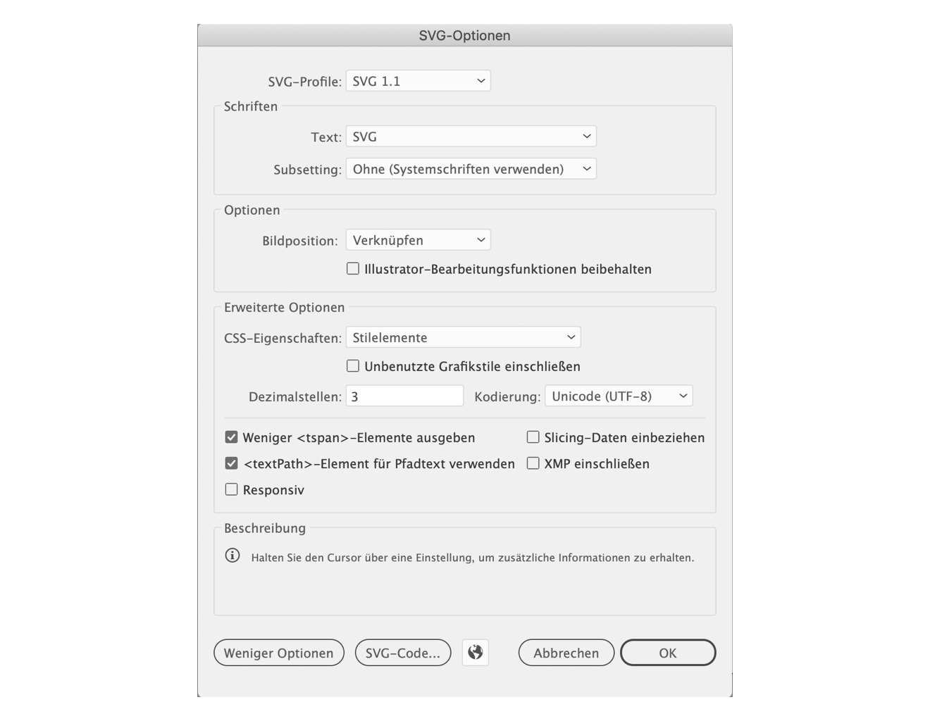
- The SVG Options dialog will then open.
- Make sure the preferences are the same as in the image below:
SVG (Scalable Vector Graphics) is an XML-based vector image format for two-dimensional graphics.
Please compress it afterwards so that it is cleaned from unnecessary code, for example:
<rect x="0.036" y="0.037" width="23.962" height="23.99" style="fill:none;"/>.
Important: Avoid the 24x24px bounding box for SVG font icon export. Recommendation: Use therefore the app or web service ImageOptim.
Note:
- Please check the vectors after illustrator export and ImageOptim rendering once again.
Sometimes files are broken. - Follow the naming conventions – see 03. Naming conventions
Implementation of icons / sketch library
- Only for sketch library export: Export the icon with a transparent bounding box layer in the background (24x24px).
- Import into sketch. Follow the dartboard built & naming conventions there
- Final review/approval will be done by one of our designers
Important:
- Please name all icons in English, no matter if they are used globally or regionally.
- Please name them individually and uniquely
Product icon
Product icon
Example/naming convention for font:
Name within sketch library:
Atom / Product Icon / [Assets] / Icons / Help
Functional icon
Functional icon
Example/naming convention for font:
Name within sketch library:
Atom / Functional Icon / Action / Lock / Lock
Atom / Functional Icon / Action / Lock / Lock O
Style principles

Line
By scaling icons, the line weight increases. Icons with 40x40px are completely built with 1 pixel line weight.

Circle
Icons generally appear in a circle – either an outline circle with the same line weight, or a circle filled with a color background.

Rounded corners
Please use rounded shapes and corners for icons. Rounded corners are a style element.
Icon sizing for web
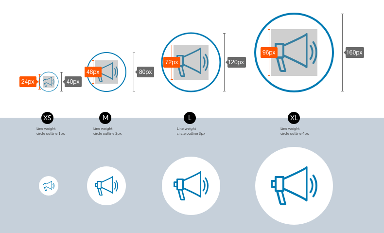
Different applications have different icon sizes and line weights.
Swipe to view more
|
Size
|
Artboard
|
within a circle of
|
|---|---|---|
| XS | 24x24px | 40x40px |
| M | 48x48px | 80x80px |
| L | 72x72px | 120x120px |
| XL | 96x96px | 160x160px |
Exception for mobile use:
Swipe to view more
|
Size
|
Artboard
|
within a circle of
|
|---|---|---|
| S | 64x64px | 40x40px |
Icons for online use
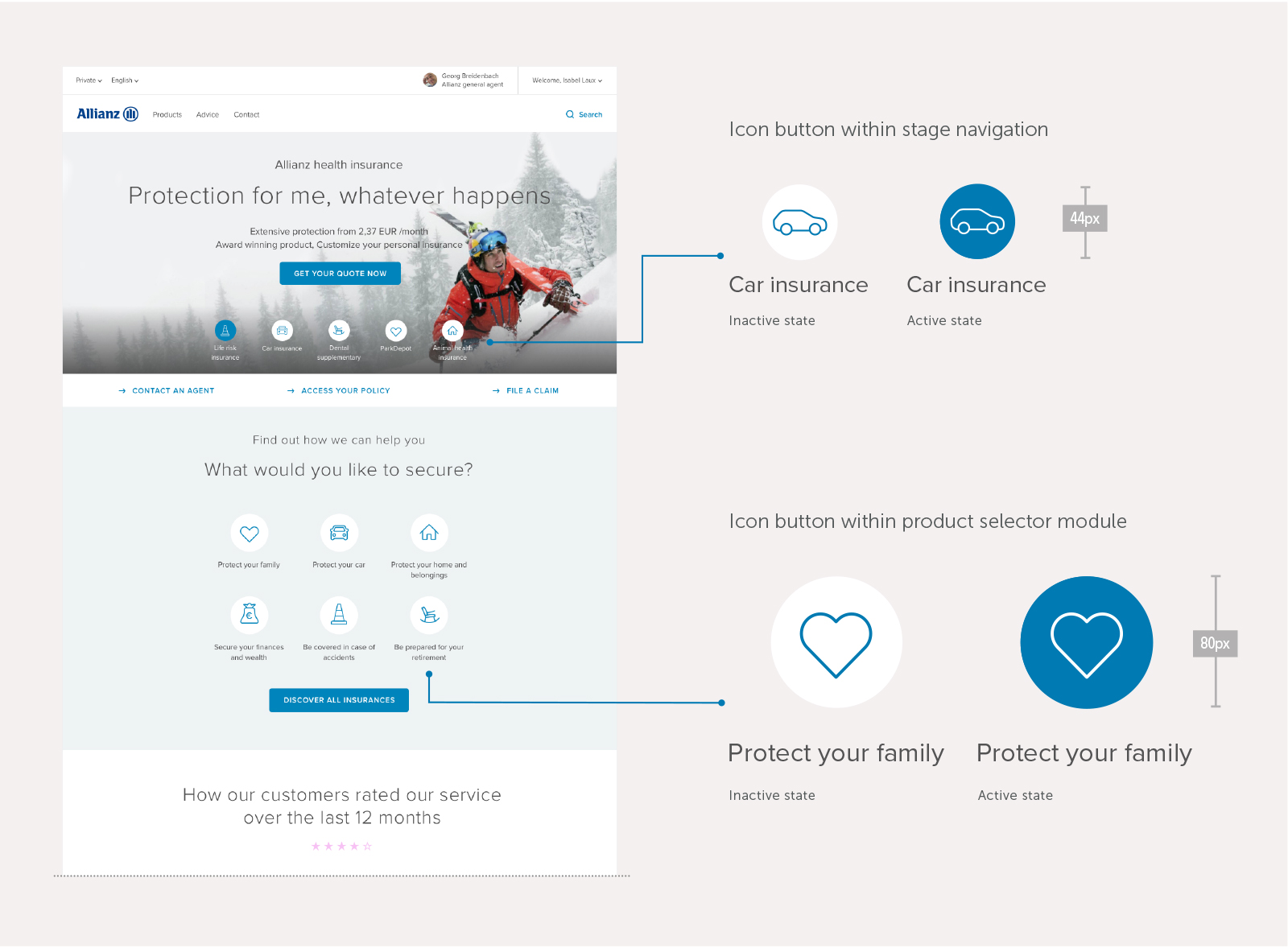
Icons on desktop – Inactive and active states
If the digital icon is inactive, it is surrounded by a white circle background. Active icons have blue filled circles.
Note: Allianz icons can also be used without circle if they have a functional purpose, e.g. in links, lists or for navigation purposes (within flyout navigation).
Icons on mobile
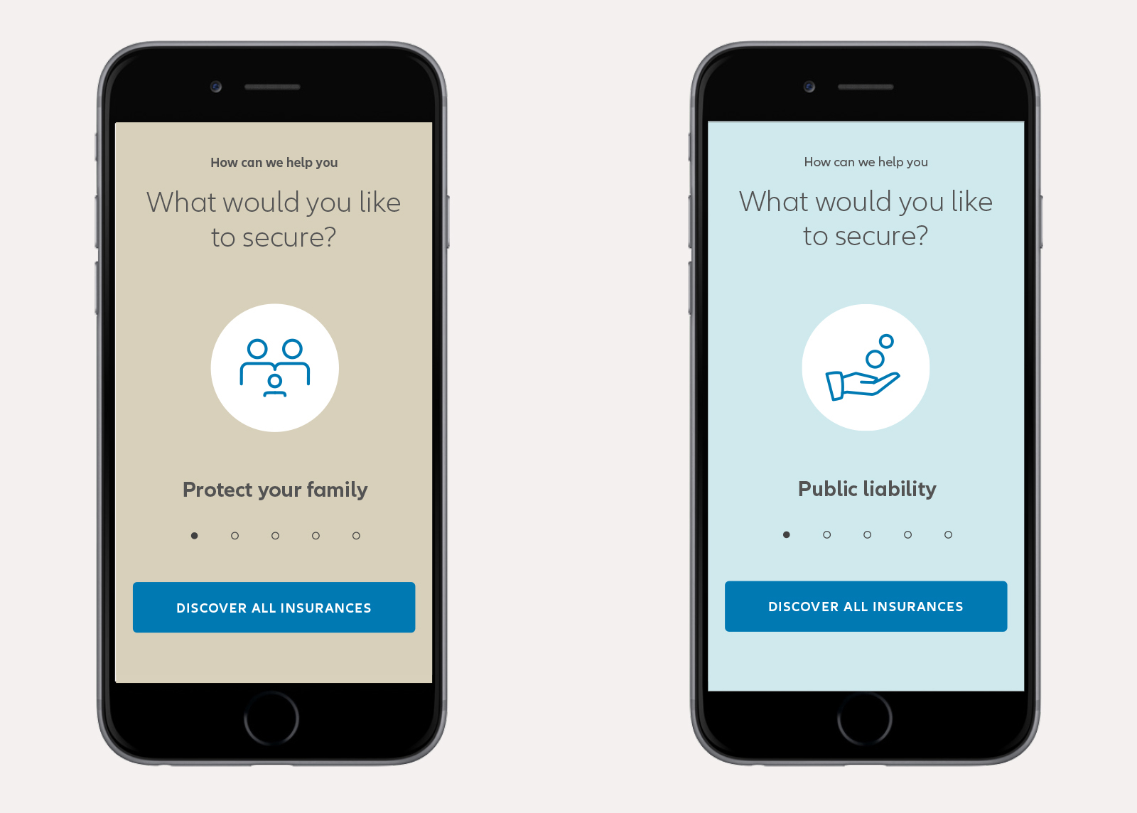
Functional icons
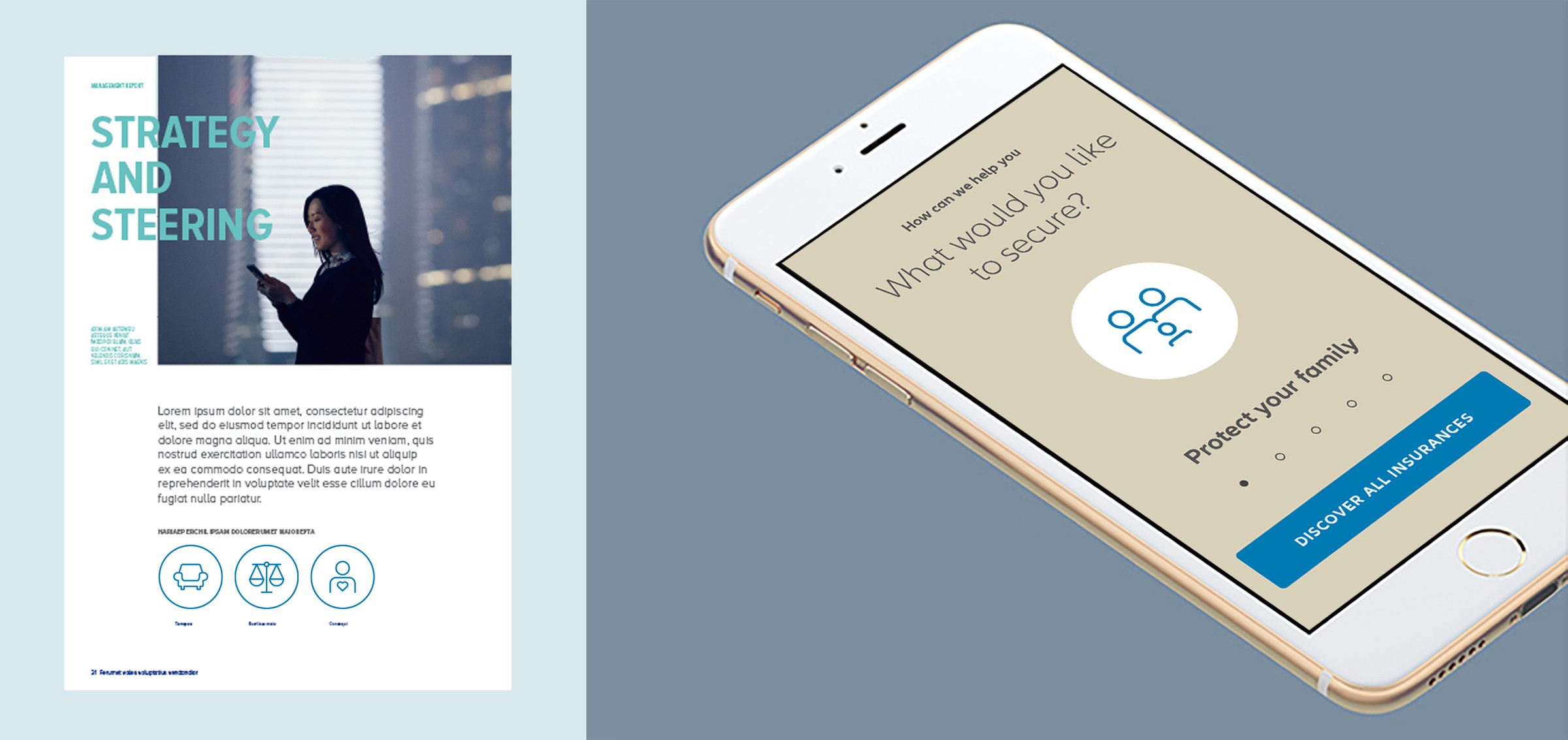
Functional icons are an important part of our digital universe. They are used to indicate important actions and functions like search, close or links. We created 64 icons that can be used in all our digital applications.
Multiplatform concept examples:
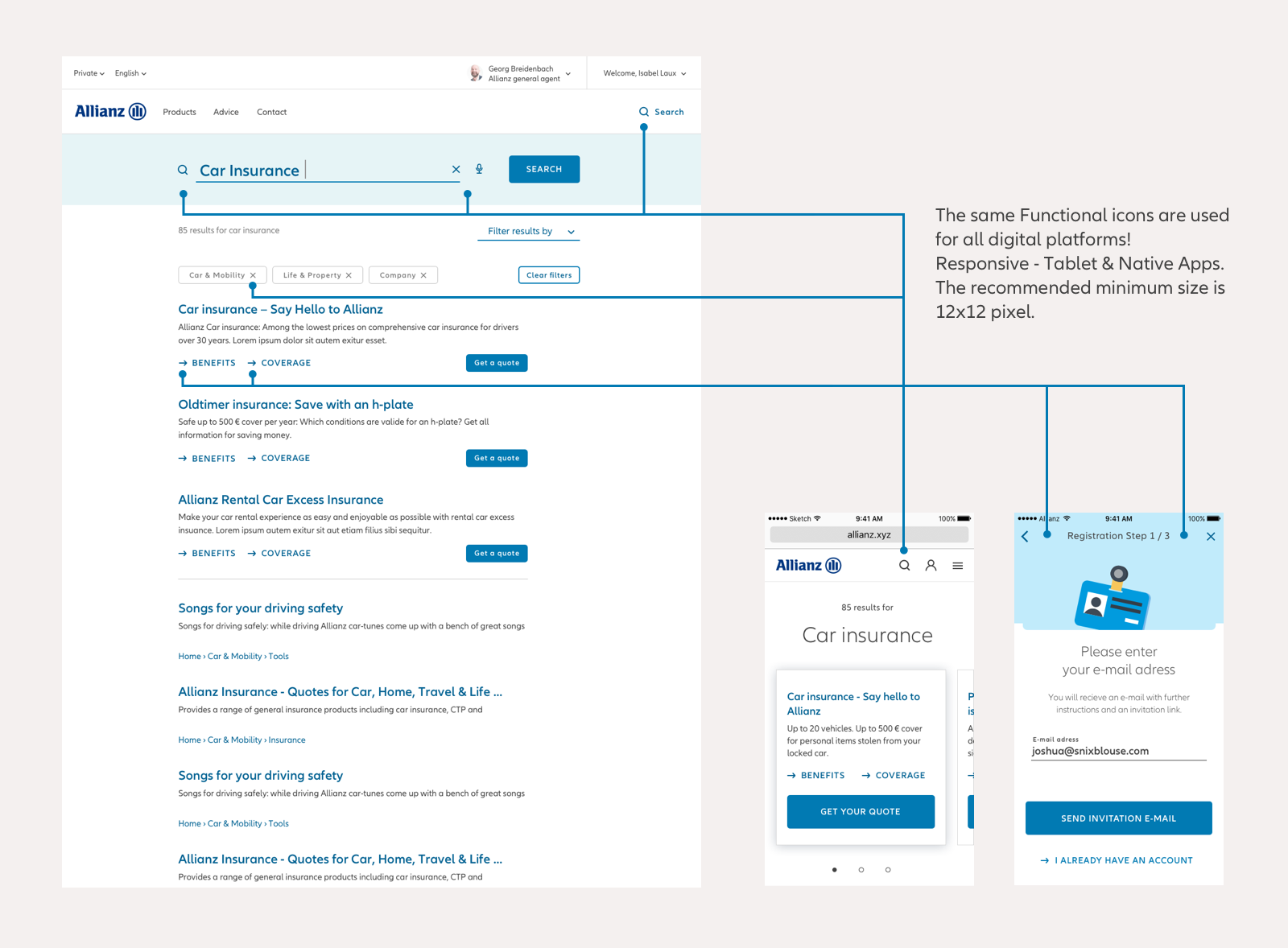
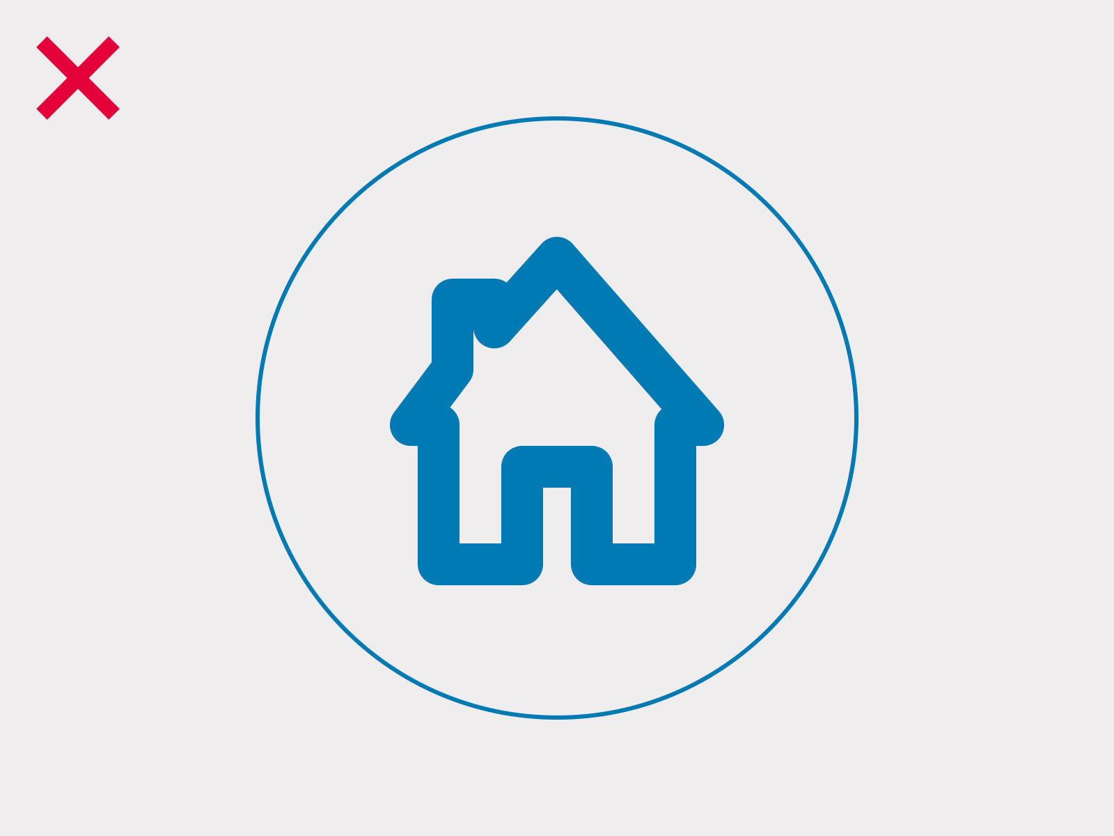
Iconography Don'ts

Don't use the inner objects in combination with rectangles.

Don't use sharp edges and corners.

Don't use uppercase letters for body text. This is only used for headlines.
Don't use thicker or thinner lines.

Don't distort the icon.
How to request new icons
Requests for new global icons
- Golden rule: Does the icon have global business relevance? Or can we use a similar existing icon instead?
- Background: Performance problems if too many (unnecessary) icons are used within the icon font.
- Write a demand ticket (OMPRO oneMarketing). Ticket will follow the demand process.
Requests for new local icons
- »Blank« icon font: If an OE has its own icons (specifically for their applications), AZTech can offer a »blank« icon font: means a code setup, which can serve you easily to implement your local icons. It contains the icon Unicodes of each icon of the global font set. Knowing the exact icon names and associated Unicodes will help avoid conflicts with the global font.
- Write a demand ticket (OMPRO oneMarketing) with your results. Please provide also an overview of all icons.
The ticket will follow the demand process – also for local purposes.
Related content
These articles may also be interesting for you


Resources for designers and developers

Pattern Lab

Living styleguide implementing the B2C components in HTML and CSS for AEM

Angular NDBX

Angular NDBX UI components enable building Allianz branded Angular applications