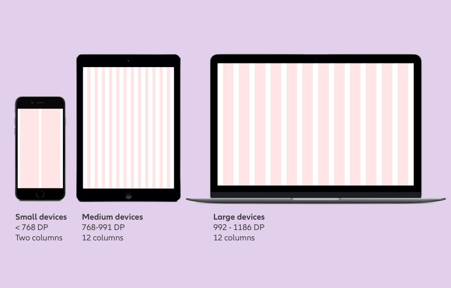
Responsive grid with breakpoints used for NDBX
Viewport & Grid
Guidelines and tips for responsive web
NDBX responsive websites
The new Allianz digital brand expression is designed to be flexible – so you can create engaging and dynamic applications for a modern and user-centered experience.
Our aim is to replicate the familiarity of the personal insurance agent online, through sympathetic and helpful design that's simpler, faster and easier to use.
The quick guides below provide a brief overview of the key elements from the master guide files. These contain a comprehensive list of features, including: content variants, desktop/tablet/mobile implementation, measurements, hints on usage, as well as information on accessibility, usability, and responsive behavior.
The quick guides below provide a brief overview of the key elements from the master guide files. These contain a comprehensive list of features, including: content variants, desktop/tablet/mobile implementation, measurements, hints on usage, as well as information on accessibility, usability, and responsive behavior.
Quick guides
Website elements
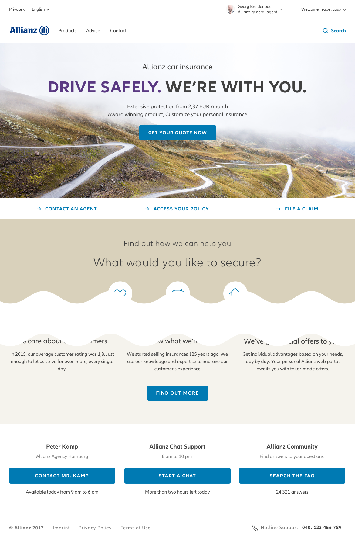
Header
Please see the header section for more information.
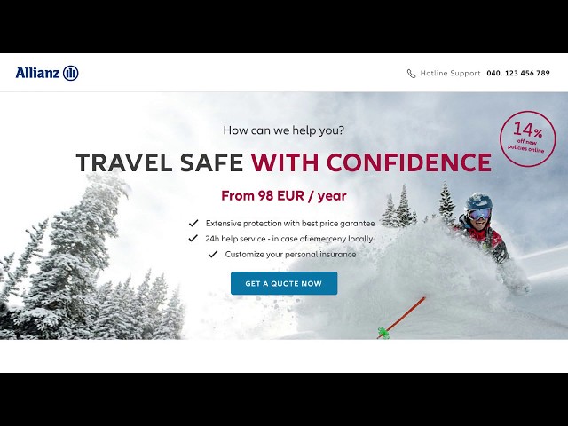
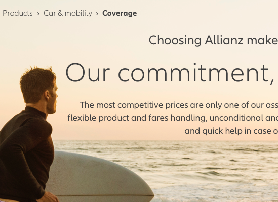
Stage (static version)
Please see the stage section for more information.
Button (primary version)
Please see the buttons section for more information.
Link group
Please see the links section for more information.
Footer (lightweight version)
Please see the footer section for more information.
When to apply edge-to-edge design
Edge-to-edge design only applies to background elements (e.g. colors and images or line elements) that use 100% of the content grid width. Actual page contents (e.g. text, tile content, lists, tables, content images) should always be displayed within the content grid and don’t extend to the browser edge.
Sample user flows
The Allianz digital brand design includes the building blocks (atoms, molecules, organisms and page types) to produce engaging digital products for different customer journeys. In this section, we’ve included sample user flows to create an impression of the digital brand experience. In addition, an overview of page types is available below.
Blueprints & Assets
Take a look at the oneMarketing page types and portal blueprints for great results.
Best practice reminders
Below are some helpful reminders when preparing content for stages. Sticking to these will ensure the full potential of the Allianz visual identity system is leveraged.
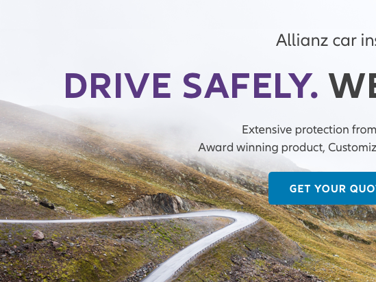
Make sure the highlight colors you use complement the imagery.

Photography choices must always reflect a sense of 'Confidence'.
Photography choices must be calm and create enough contrast for text legibility.

Title headlines on home pages and landing pages should be regular or bold and in uppercase letters. Important words may be in secondary colors.
No capital title headlines on sub-level pages. Important words may be bold and in secondary colors.

Cluttered backgrounds may be darkened to increase the legibility of the overlay text.