Allianz infographics
Infographics
Say a lot in simple, easy-to-understand visuals
Simplify complex information
Infographics play an important role for the Allianz brand. They help bring important information, complex processes and key data to life in a simple, engaging and consistent way.
Create eye-catching infographics for every purpose

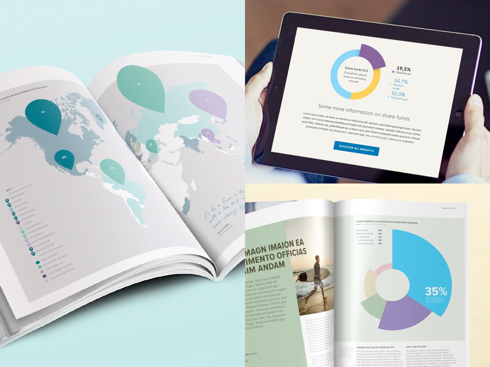
Desktop digital
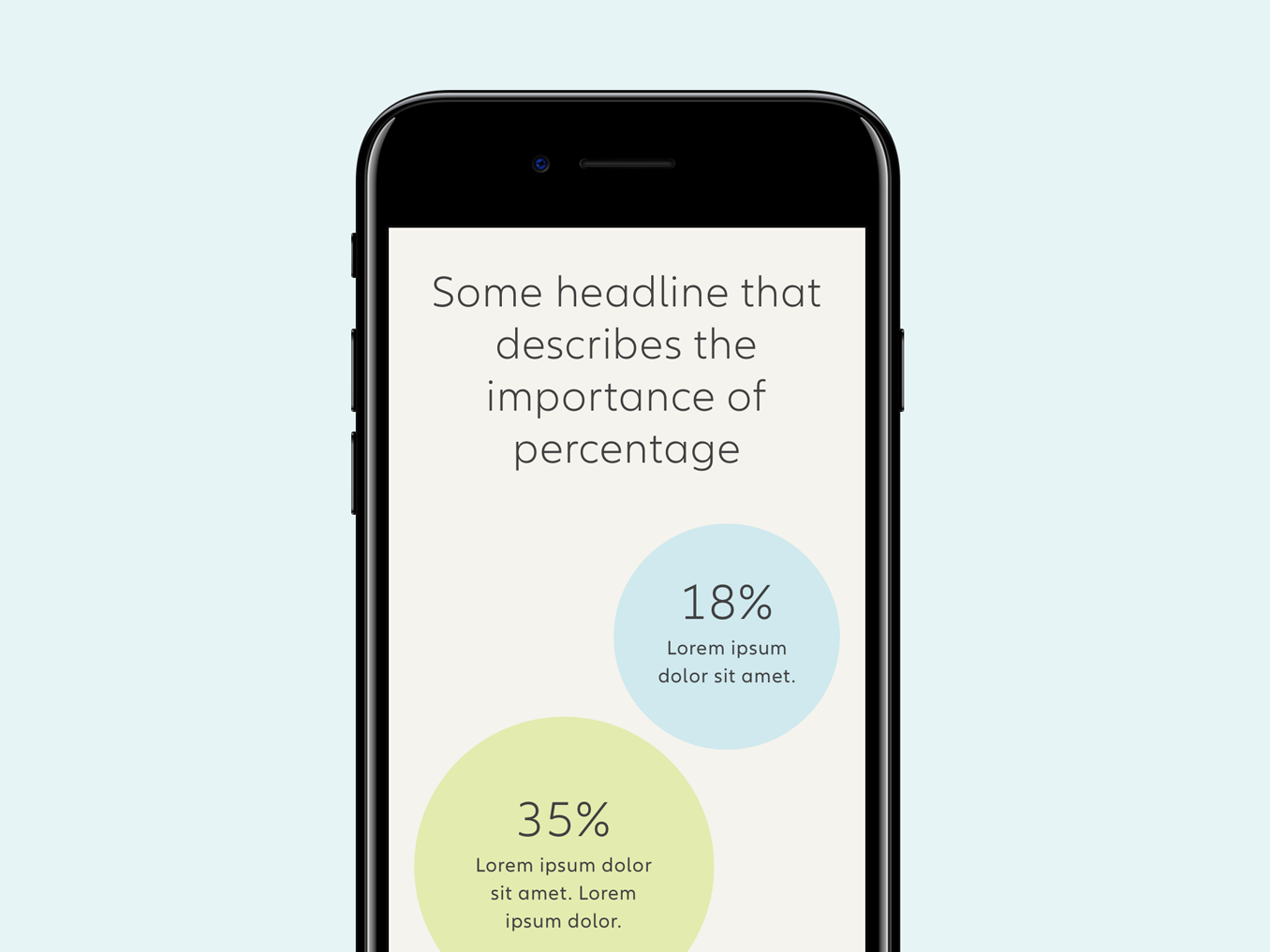
Responsive mobile
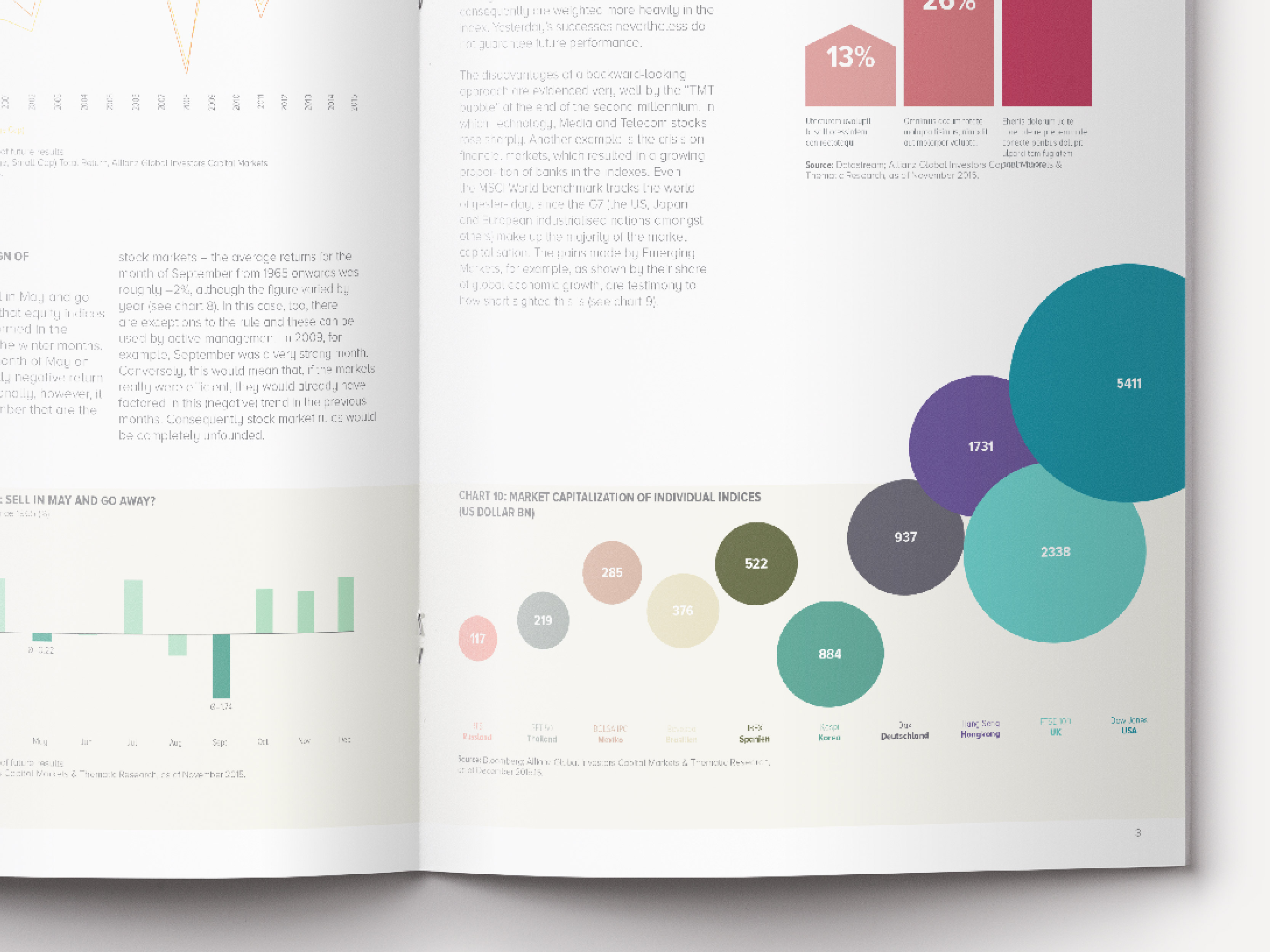
Spreads
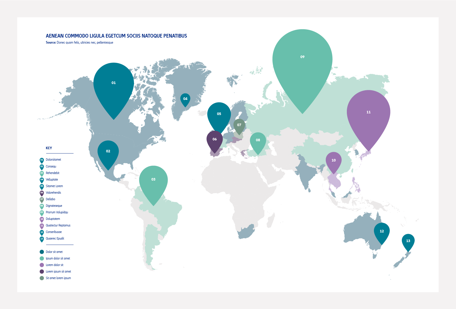
Infographics at a glance
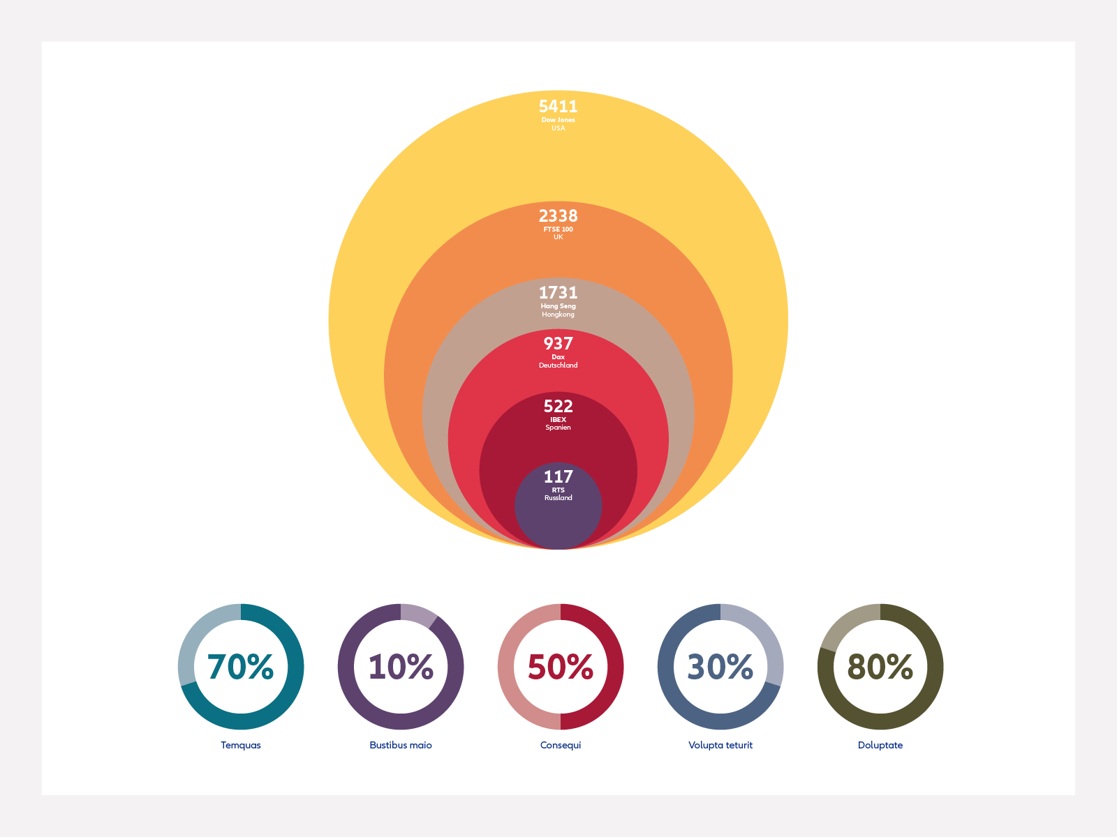
When creating infographics, be creative. Use scale and different types of arrangements to highlight important details. Vector drawings should be simple and flat, with minimal details to keep them easy to understand.
Use the new color palette to either match the colors or make them stand out from other colors on the page.
Flexibility and creativity is integral to our new brand expression. As a contrast to the structure of the layout system, which uses boxes, use the data provided to create eye-catching and dynamic infographics.
A few things to remember
Below you'll find some best practice examples for infographics.
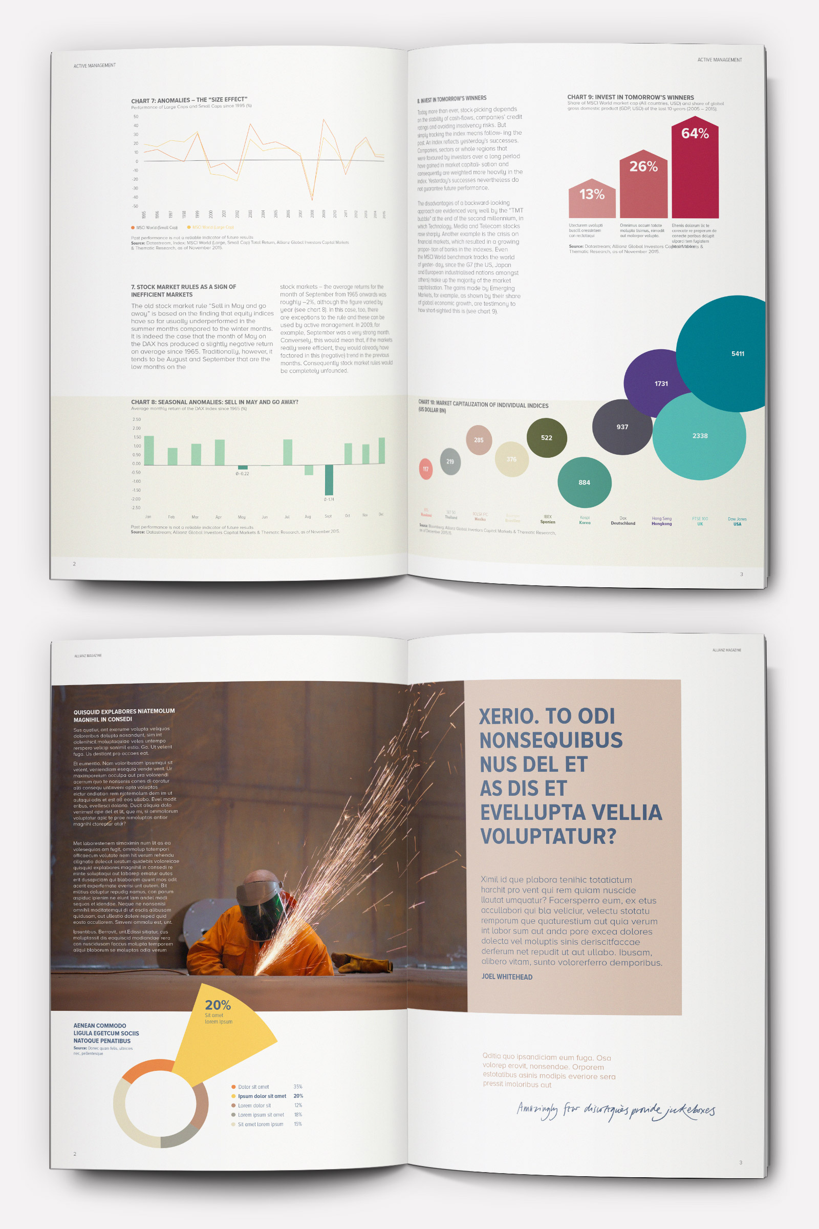
- Be creative and playful, using scale and different arrangements to highlight important details.
- Use our color palette to create coordinating infographics or more vibrant ones that stand out on the page.
- Don't use too many different colors. Tints can be used at 75%, 50% and 25%.
- Less is more. Use only the elements you need to highlight your important data.

- Charts can be used on a white background, or placed within a tinted color to highlight areas within the layout.
- Think about how you want the reader to navigate the information. Use colors and scale to create a clear hierarchy within the data.
- Infographics must always be 2D with solid colors. Avoid additional effects and embellishments.
- Vertical and horizontal keylines can make it easier to navigate and read data.
Infographics Don'ts
Below are examples of graphic treatments that you should avoid when creating Allianz infographics. Applications such as Microsoft Word or PowerPoint have a library of different effects, such as 3D shadow elements, which are not permitted for use.

Don't add drop shadows.

Don't apply graphic textures.

Don't apply 3D effects.

Don't use colors combinations that lack contrast.

Don't apply gradients.