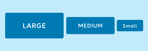
Buttons are styled links that allow the user to visit other pages or complete an action. They make common actions immediately visible and easy to perform.
Discover our Components
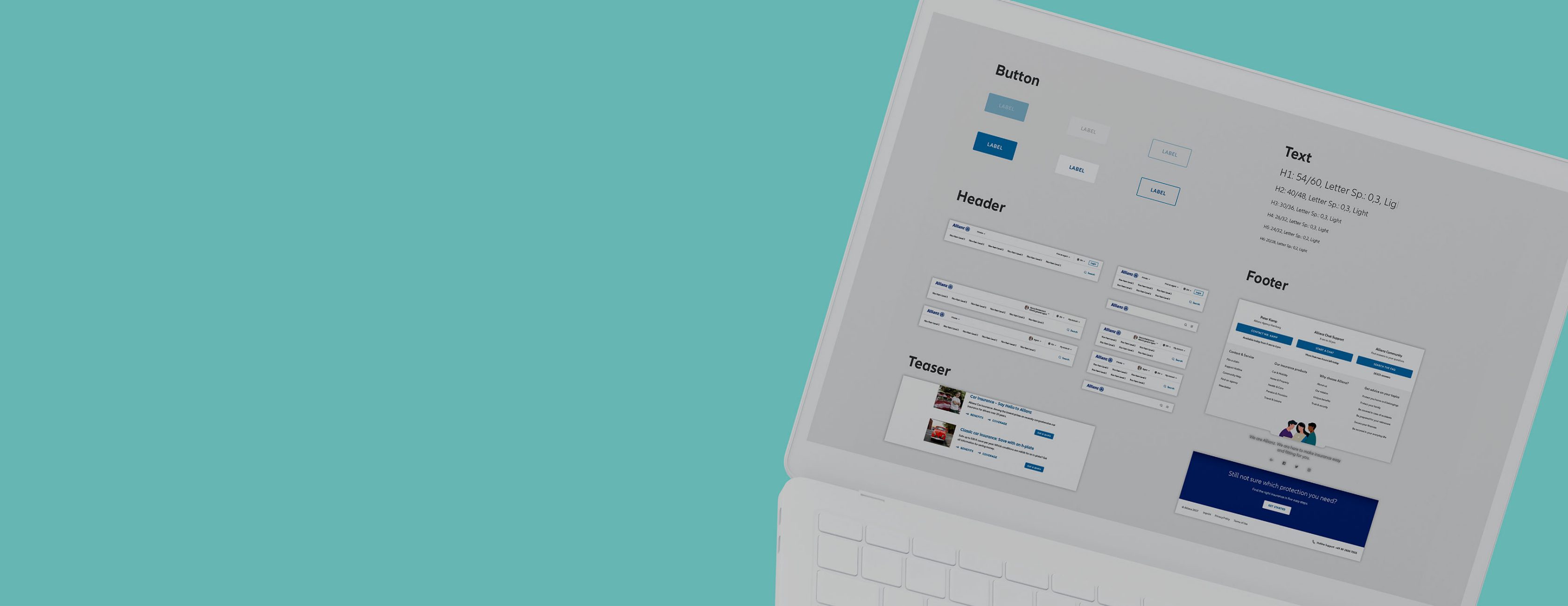
The building blocks of our media
We designed and coded each component to solve a specific UI problem. All NDBX components work together smoothly as parts of a greater whole.
Our available components
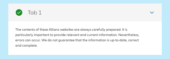
Accordion
An accordion is a vertically stacked set of expandable containers used for grouping and displaying long sections of information. This component helps users find what they're looking for more quickly.
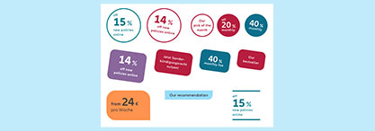
Promotional element
The promotional element is a specially designed textual element that attracts users’ attention to a particular piece of content. This pattern is used for promoting products, giving recommendations or guiding through transactional processes.
Description on Creators

Breadcrumb
The breadcrumb is a type of secondary navigation that indicates the position of a page in its application hierarchy. This component enables users to quickly identify their location within a path of navigation and move up to a parent level if desired.
Description on Creators
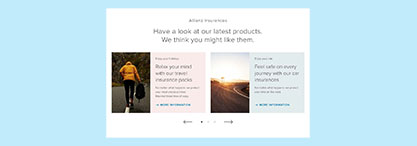
Carousel
The carousel is a control that allows the user to browse through a set of items. This pattern optimizes the screen space by displaying only a sample of the content in a circular view.
Description on Creators
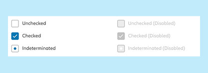
Checkbox
The checkbox is a control that allows the user to select one or more items from a list. This pattern is also used in case of binary choices such as "true/false", "yes/no" or "on/off".
Description on Creators
Circle toggle
The circle toggle is a control that allows the user to switch "on" and "off" one particular option. It is able to simulate radio button group behaviour by restricting the user to choose only one from the listed options.
Description on Creators
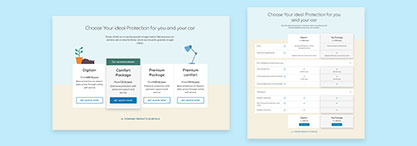
Comparison
The comparison module offers key features overview of products or services. This pattern is used to support the user by identifying the differences between the displayed items and to ease the decision-making process.
Description on Creators

Date picker
The date picker is an input field with a special feature that allows the user to select a date from a popover. To trigger the Popover the user has to click, tap on the calendar icon or use the keyboard shortcuts.
Description on Creators
Divider
The divider is a thin line that visually segments content into groups.
Description on Creators
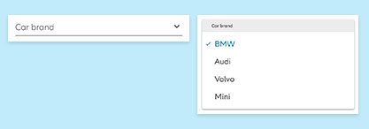
Dropdown
The dropdown allows the user to select one or more items from a predefined list that is hidden by default. Its display is triggered by a click on the single-line Input Field.
Description on Creators

Footer
The footer is an area located at the bottom of the screen. It provides particular legal information, relevant contact and navigational links.
Description on Creators
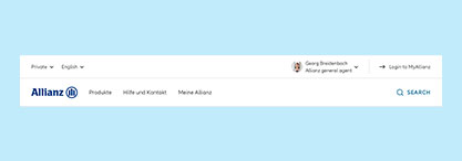
Header
The header is the uppermost component of a screen. It provides branding, navigation, search, and access to global application actions such as settings and notifications.
Description on Creators
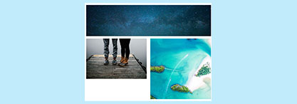
Image
Images are used to support visually the content on the screen. They can both enhance the user experience and express a brand’s visual language.
Description on Creators

Link
The linkink is clickable text that direct the user to another page. This pattern is primarily used for navigational purposes and doesn't usually trigger functionalities (like the button does).
Description on Creators
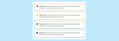
Message
Notifications make users aware of important information related to their current activity.
Description on Creators
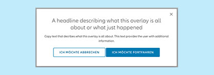
Modal
The modal is a secondary window, displayed as a layer on top of the current page, which allows the user to maintain the context of the task below.
Description on Creators
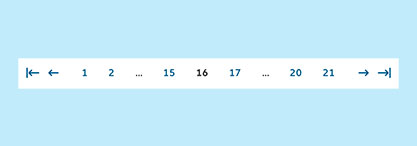
Pagination
The pagination is used for splitting up content or data into several pages. The user can navigate through the content by clicking on a particular page indicator or interacting with one of the special controls.
Description on Creators

Popover
The popovers are overlays that offer detailed information in a compact way without leaving the context of the current page. This component is displayed on demand by triggering link, button or icon.
Description on Creators
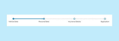
Progress bar
The progress bar is visual representation of a process. This pattern is commonly used in order to help the user follow the progress of a larger task. To decrease the information load, the task is divided into smaller sub-tasks.
Description on Creators
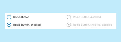
Radio button
The radio button is a control that allows the user to select only one from a list of two or more mutually exclusive options.
Description on Creators
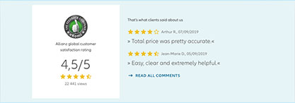
Rating
The rating is a set of star icons that allows the user to evaluate content, product or service. This pattern is commonly applied to collect user's feedback.
Description on Creators
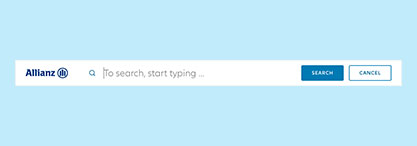
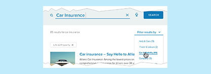
Search
Search is a special input field that enables users to specify a word or a phrase in order to find particular content without the use of standard navigation patterns.
Description on Creators
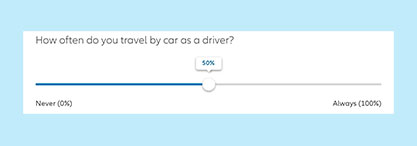
Slider
The slider is a control that allows the user to select a value from a predefined range, using a given granularity.
Description on Creators

Spinner
The spinner is an animated loading indicator that informs the user about ongoing operation in the system background. This pattern communicates that the system is working properly according to the requested action.
Description on Creators
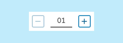
Stepper
The stepper is an input field with special controls that allow the user to increase or decrease a numeric value stepwise.
Description on Creators
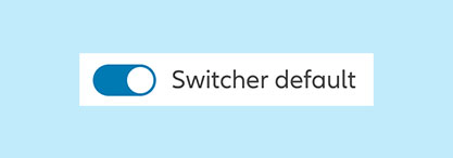
Switcher
The switcher mimics a physical switch that allows the user to turn individual settings instantly on and off.
Description on Creators
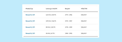
Table
The table displays raw data sets in structured way, which allows the user to compare and scan information more easily.
Description on Creators
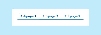
Tabs
Tabs is a set of navigational links used to quickly switch between related content sections. This pattern makes it easy to organize content by grouping similar information.
Description on Creators
Tag List
A tag list is a set of tags used to indicate what filter criteria is currently applied to search results and to which categories particular content is assigned to.
Description on Creators
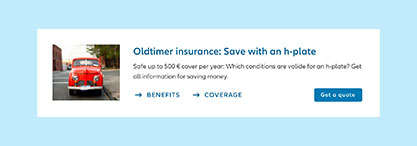
Teaser
A teaser is made of a title (heading) and a text segment. Additionally, it can also contain actions in the form of links and buttons, images and meta data such as the date and category.
Description on Creators
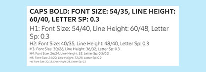
Text
The text is visual representation of a language. Its typography and styling communicates as well the importance of the information as the values of the brand.
Description on Creators
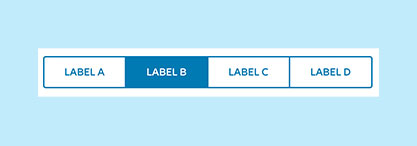
Text toggle
Text toggle joins two or more buttons into a unified control, that allows the user to pick one of up to four mutually exclusive options, states or actions.
Description on Creators
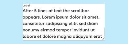
Text area
The text area is an input control that allows the user to enter several lines of text. Initially this pattern appears as a single line field, which is useful for compact layouts that occasionally need to be able to accommodate large amounts of text.
Description on Creators
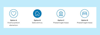
Tile
The tile is a flexible container that house a variety of content. This component is used for grouping similar concepts and tasks together, making the content easier to scan and read.
Description on Creators