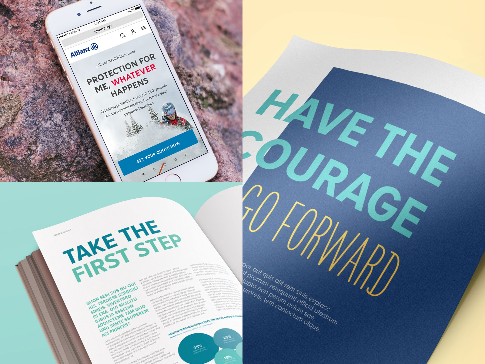
Our new font has a modern and friendly feel, allowing us to speak confidently and consistently across all communication. We also use a variety of handwriting styles to add a human element to our layouts, reflecting the lives of our customers and employees.
Typography
Our unique signature
Introducing Allianz Neo
-
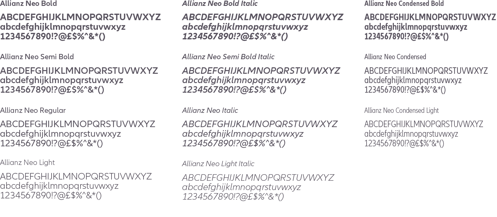
Allianz Neo
-
Using Allianz Neo
-
Details
Allianz Neo
Our new font has a modern and friendly feel, allowing us to speak confidently and consistently across all communications. We also use a variety of handwriting styles to add a human element to typographic layouts to reflect the lives of both our customers and employees.
Usage
Depending on the context of our communication, we use different typographic styles. More sales-oriented media, such as product advertisements and brochures, should feature a mixture of type sizes and weights. Our typography in business-to-business applications – particularly financial reports and fact sheets – should have a more refined style. This is achieved using less variation in type sizes and weights, so it feels more sophisticated.
Details
Allianz Neo Character Set includes the following country-specific versions:
Western European
Afrikaans, Albanian, Basque, Breton, Catalan, Danish, Dutch, English, Faroese, Finnish, French, Gaelic, Galician, German, Icelandic, Indonesian, Irish, Italian, Malay, Norwegian, Portuguese, Spanish, Swahili, Swedish
Central European and Baltic
Albanian, Croatian, Czech, Hungarian, Polish, Rumanian, Serbian (Latin), Slovak, Slovenian, Estonian, Latvian, Lithuanian (Baltic)
Turkish
Azeri (Latin), Turkish, Uzbek (Latin)
Allianz Neo in local markets
In areas or markets where the local languages don’t use Latin characters we recommend using the following fonts. These are available to purchase using the links below.
Arabic: Helvetica Neue Arabic
Chinese Traditionell: DF Hei STD W7 (free font)
Cyrillic: Averta
Hindi: Neue Frutiger Devanagari
Korean: Yoon Gothic 700
Thai: Prompt
Guidelines and tips for using typography
-
Typographic hierarchies
-
Rules for using H1 headlines in stages
-
Highlighting type in color
-
Using type styles
Hierarchies of type
- Know your content! Follow a logical page hierarchy based on the content.
- Profit from a clear distinction between page title, lead paragraph and individual sections of content.
- Beside SEO reasons, hierarchies bring order to chaos, make the reading experience smooth and effortless.
- Check always the mobile view: NDBX offers optimized headings.
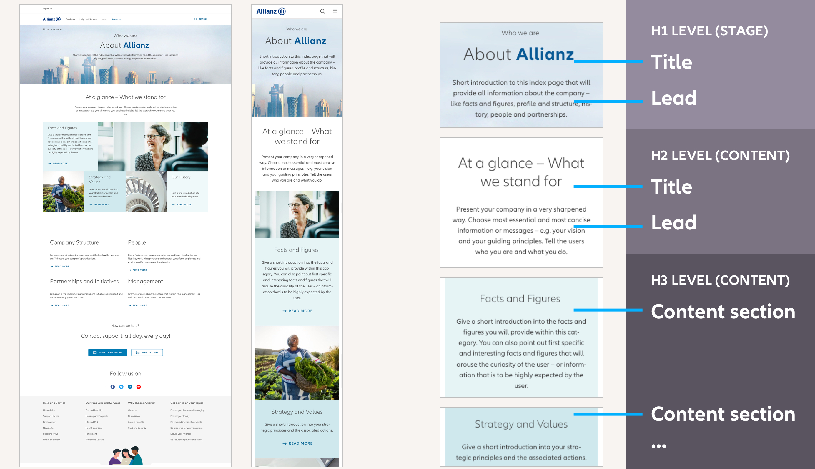
Typographic hierarchy within page types: The approach is distinctive and easy to read
Rules for using H1 headlines in stages
- The H1 headline is set in Allianz Neo light font-weight mixed letters or Allianz Neo bold caps. Don’t use Allianz Neo font-weight regular for H1 headlines.
- Be consistent and choose one font-weight option: Bold Caps or Mixed Light. Adapt it to all H1 headings on the same page hierarchy level.
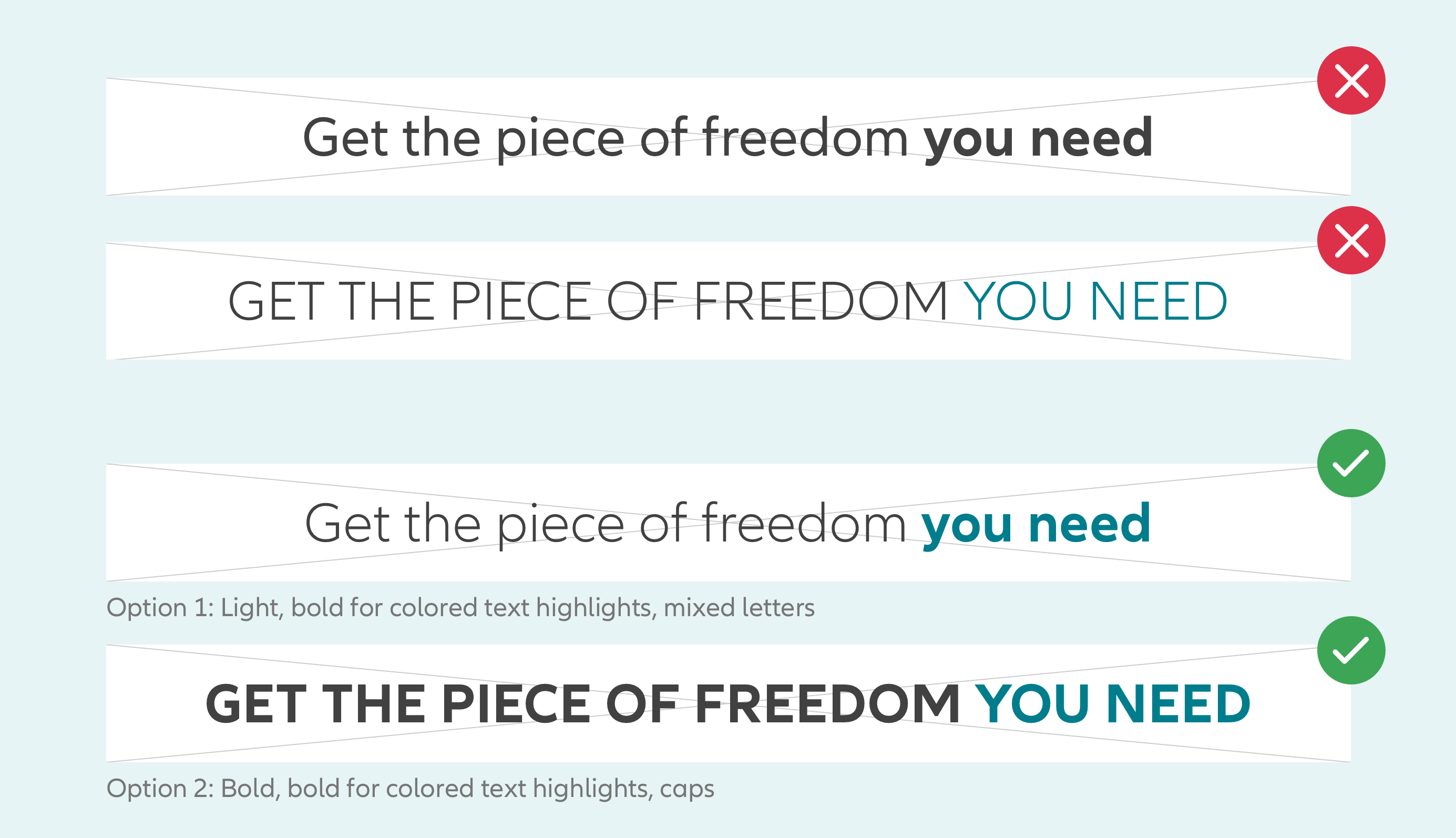
Stage H1 headings: Consider the correct mix of font-weights.
Highlighting type in color
- In order to emphasize meaning, words within an H1 headline can be colored, always set in bold font weight.
- Consider selected accessible colors, see left. They should be chosen harmonious and with enough contrast to the chosen background image.
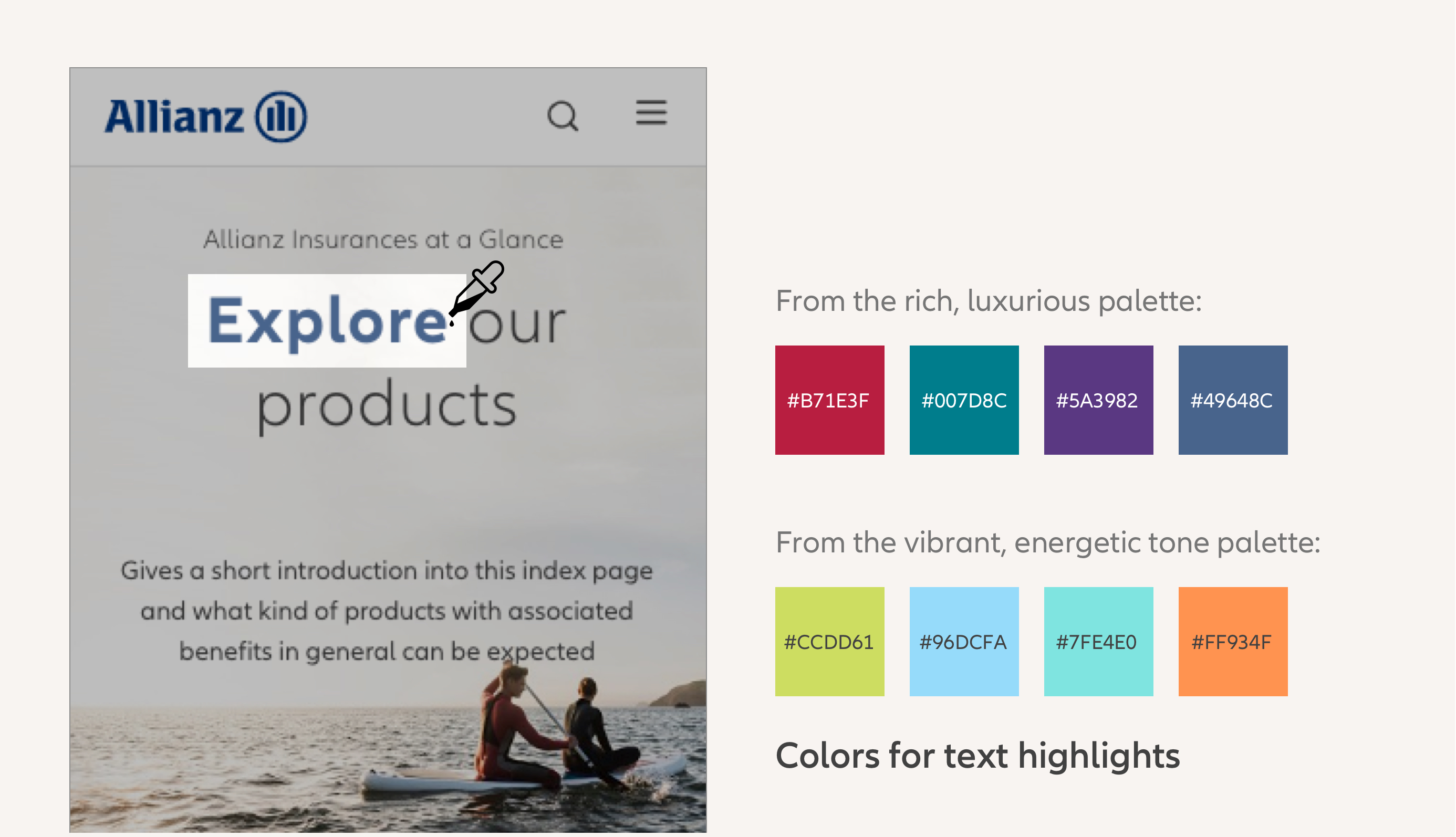
Text highlights on H1 headings: Use a color from above shown colors. Consider accessibility.
Using type styles
- The Allianz Neo font is used for all content including headings, copytext, links, buttons, etc. The font-weight, size, and style vary throughout the site.
- Light font weights and whitespace are used to structure the content. The bigger the font size the lighter the font-weight. Bold weights are mainly used to highlight short text elements, such as buttons, links or quotes.
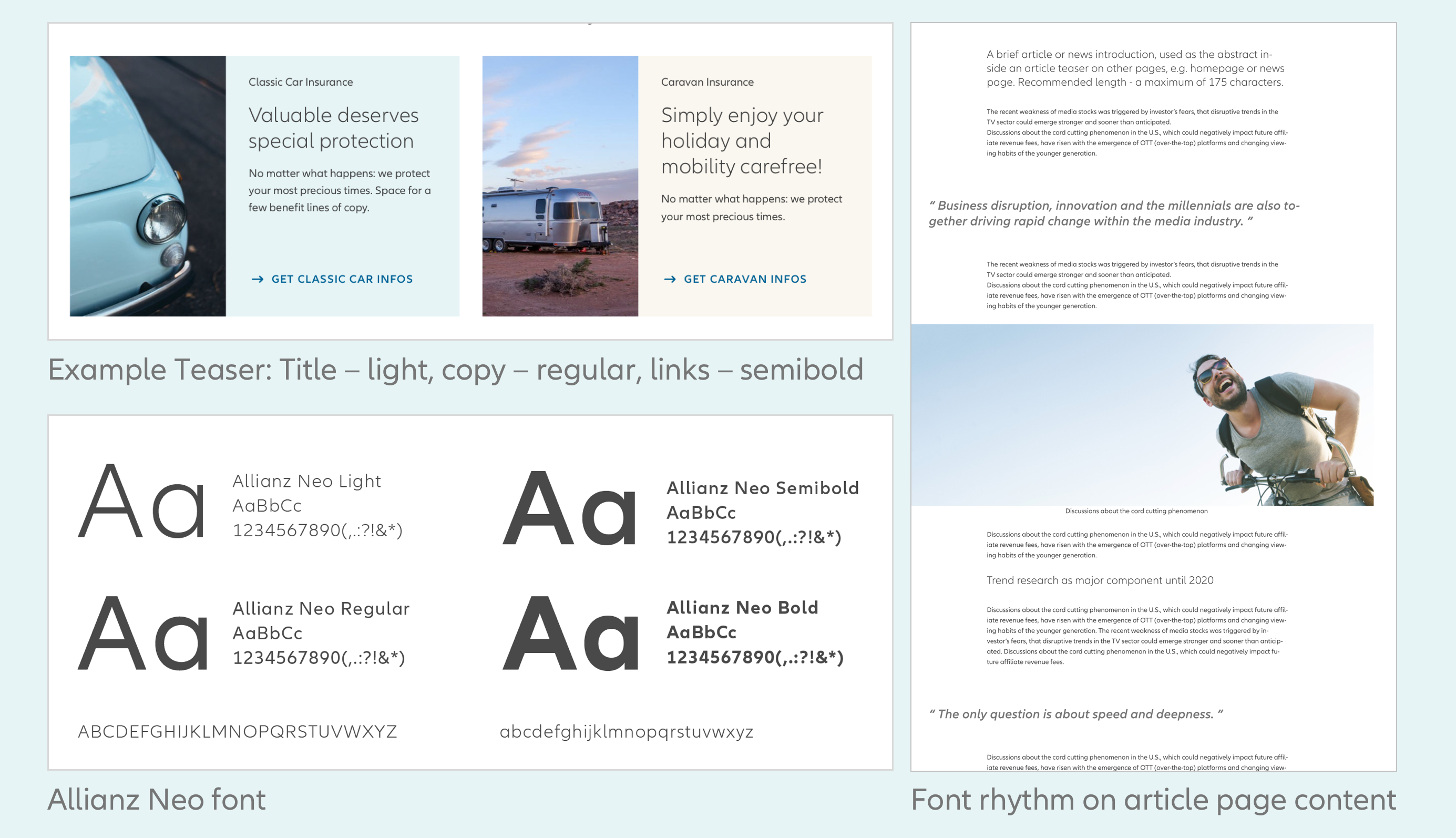
Allianz Neo font on page types: The bigger the font size the lighter the font-weight.
AEM user guide
Take a look at the design and content principles to create great media.
Typography Don'ts
Below are several ways of using Allianz Neo and handwritten fonts that we don't allow in Allianz communication.
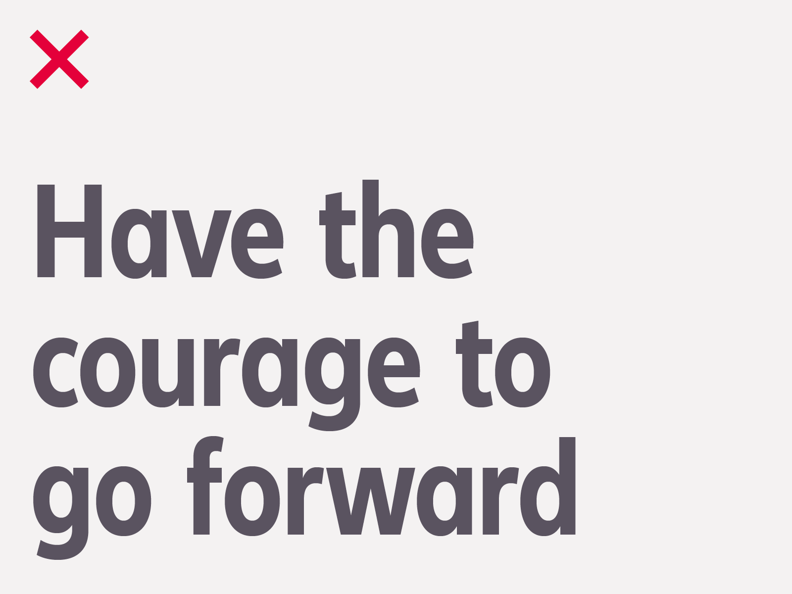
Don't use Allianz Neo condensed lowercase for headlines.
Don't use colors that restrict text legibility.
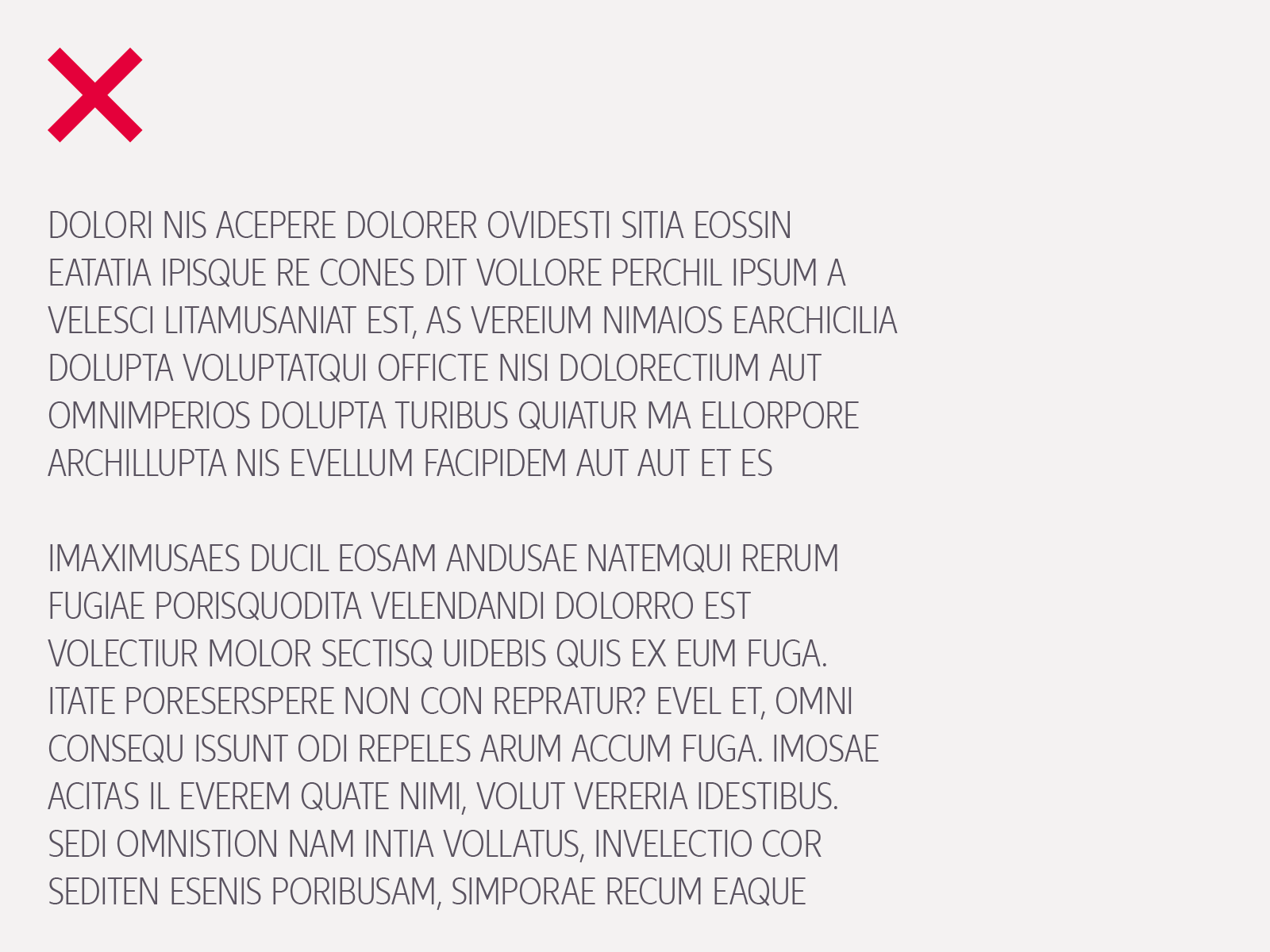
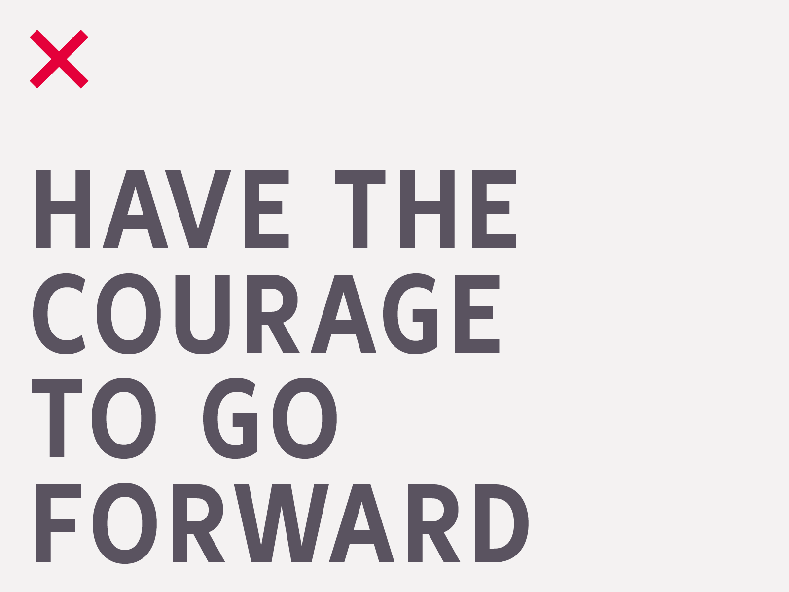
Don't use uppercase for body text. This is only used for headlines.